KAMP Hawaii
Nonprofit youth organization branding
Overview
Background
KAMP Hawaii, which stands for Kids At-risk Mentoring Program, is a Hawaiian-based nonprofit youth mentoring program.
With many low income areas in Hawaii, parents often work multiple jobs to support their families, and are not available to give their children the positive influence they need. KAMP wants to position itself as an organization comprised of good people that care about the disadvantaged youth of Hawaii, and strives to make a positive impact by offering a place of nurturing guidance.
Target Audience
Parents, kids, volunteers, charitable contributors — generally anyone who wants to help make a difference in the lives of Hawaiian youth.
Tone
Emotional, nurturing, positive, meaningful.
Concept Rationale
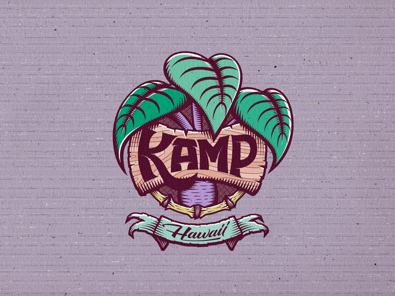
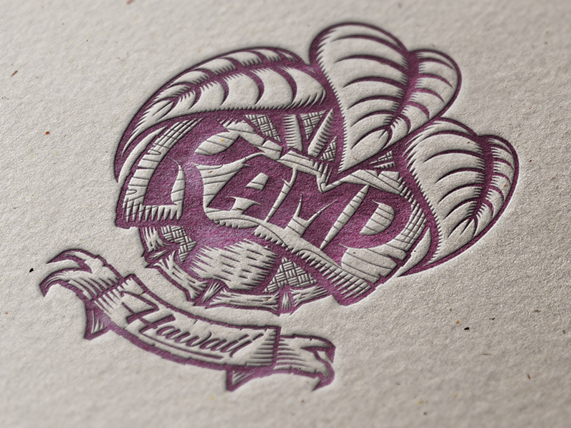
A creative consideration taken from the client brief was a request to depict a Kalo (Hawaiian name for Taro) plant, because it's been an unofficial symbol of the organization since its inception. Kalo is an important symbol, because it's not only a staple in the Hawaiian diet, it's also woven into the very fabric of Hawaiian culture. In fact, the Hawaiian Creation mythology all begins with Kalo.
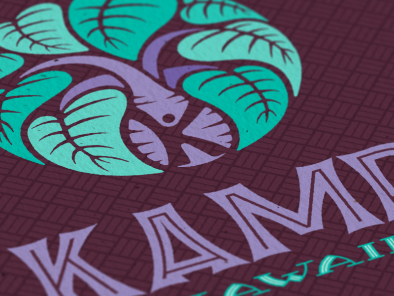
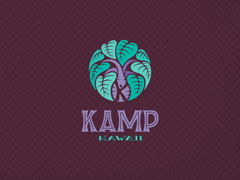
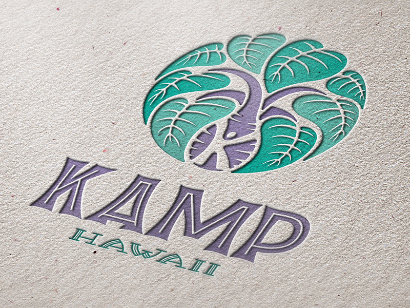
At the center of this design is the Kalo root. Inside it is a figure that represents Haloa, the child of Wakea (Father Heaven) and Ho’ohokukalai (the stars). Haloa is symbolized by the Kalo plant, and represents the original ancestor of the Hawaiian people.
Surrounding the root are eight heart-shaped Kalo leaves which symbolize the eight main Hawaiian islands Kauai, Oahu, Maui, Molokai, Lanai, Kahoolawe, and of course, Hawaii Island.
The main colors, green and violet, are symbolic of Kalo leaves and root, respectively, however the particular hues used here are stylized, modern, and fresh.
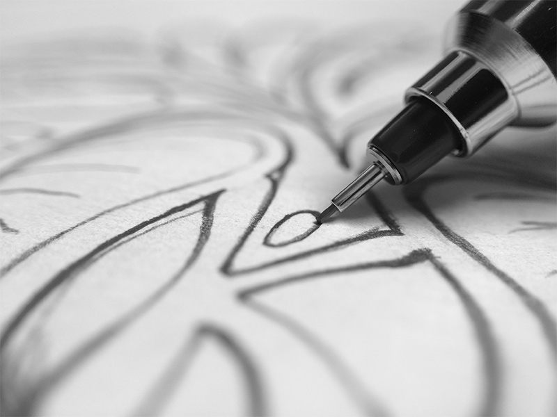
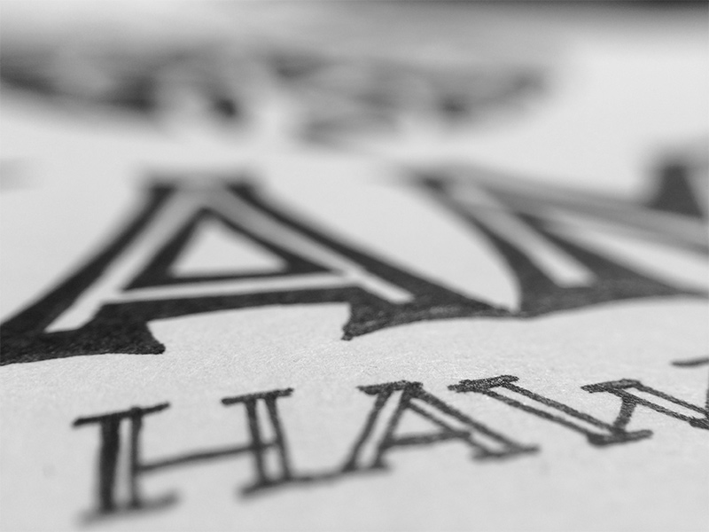
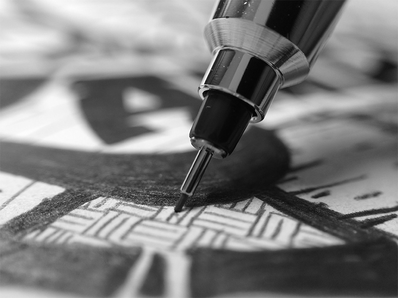
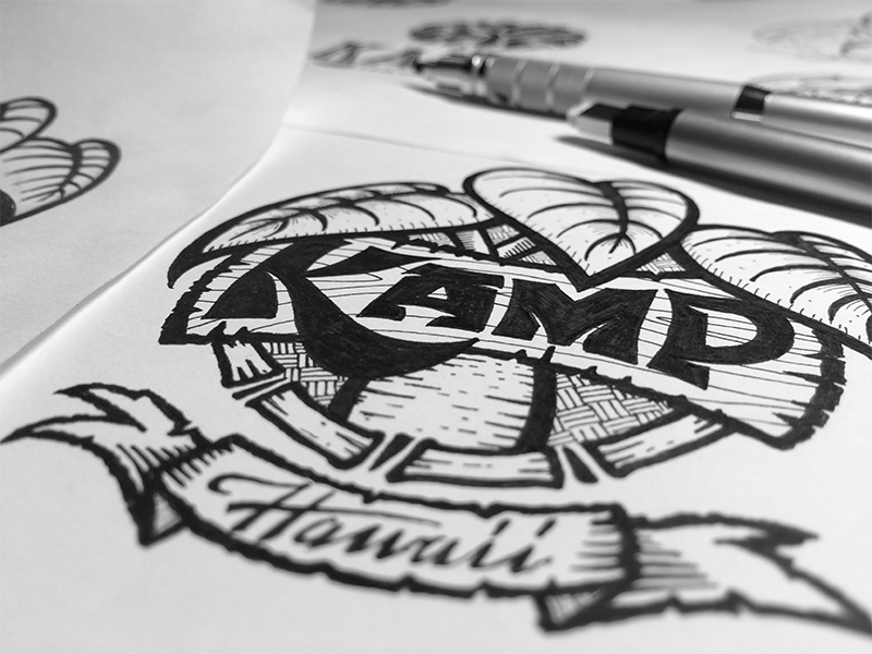
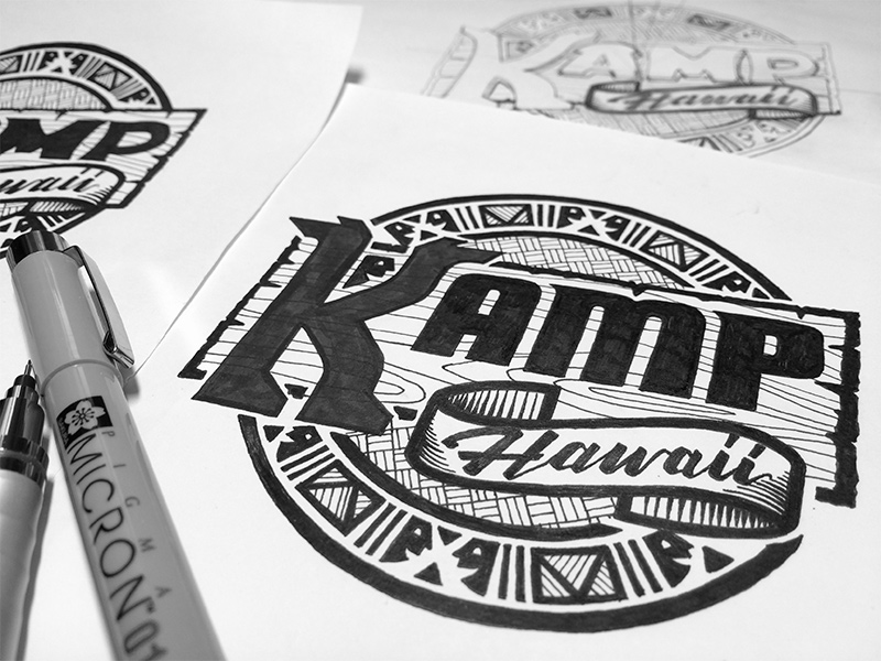
Logo development process
Sketches
Logo system
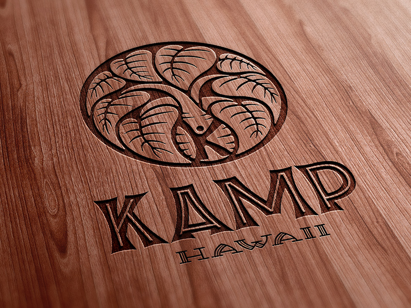
Main logo.
Secondary logo, horizontal lockup.
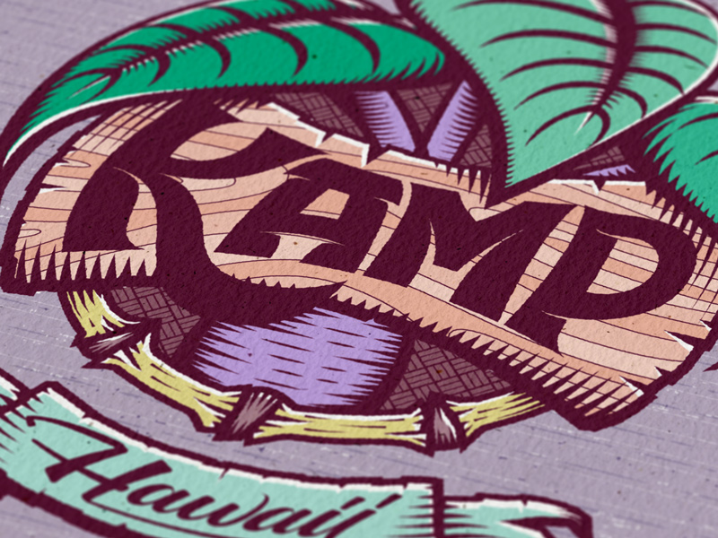
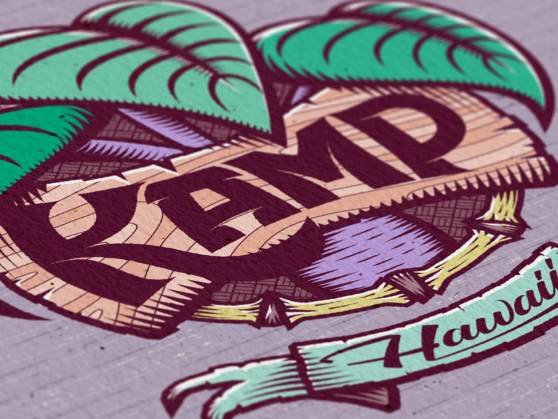
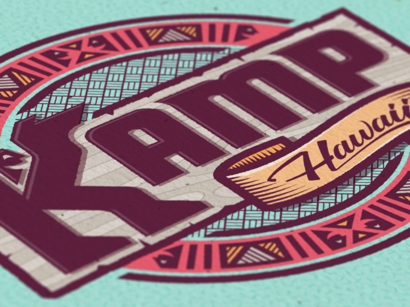
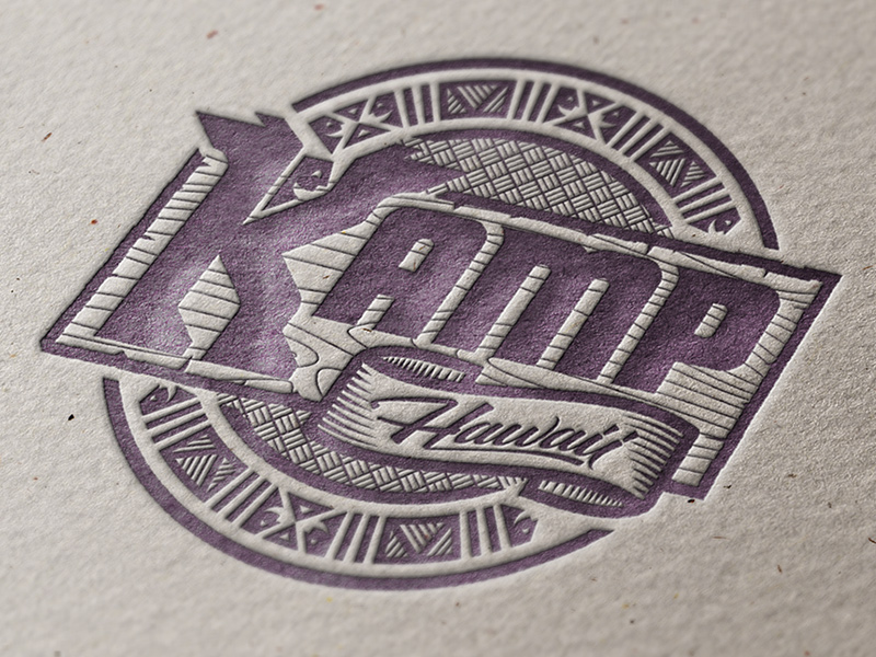
Logo detail.
Symbol detail.
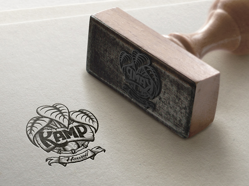
Printing techniques examples
Two color letterpress print.
One color print on burlap.
One color letterpress print.
Embroidery.
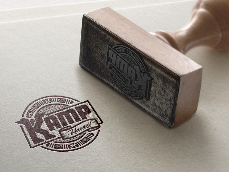
Stamp.
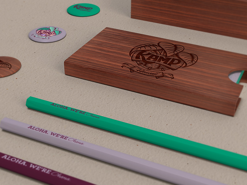
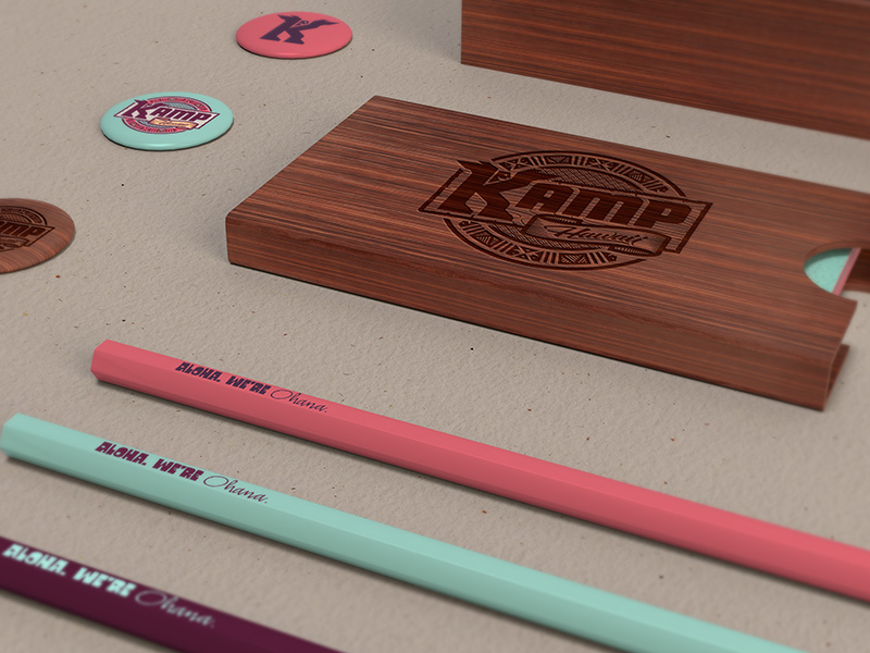
Laser-etched wood.
Examples of branding usage
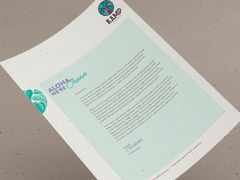
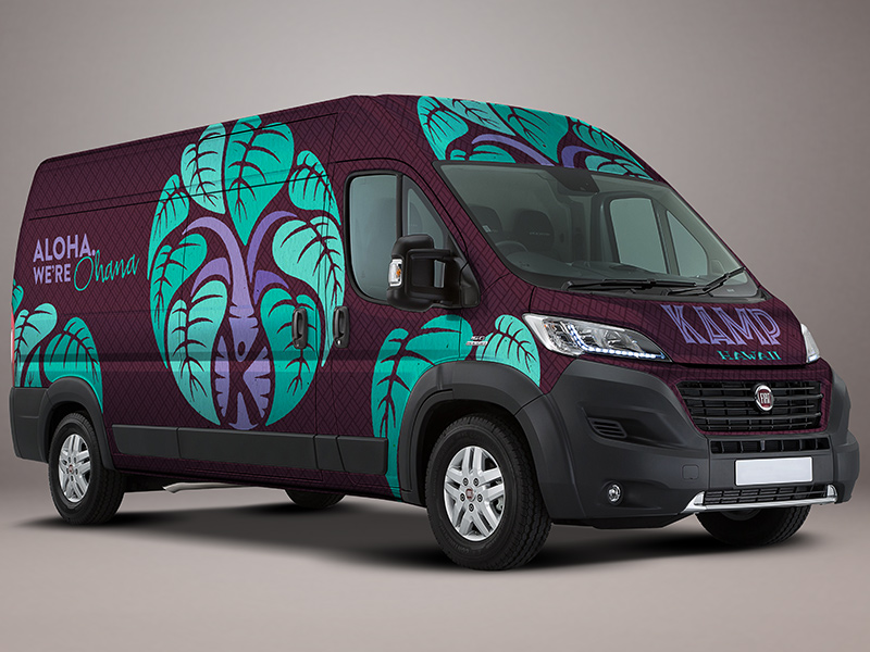
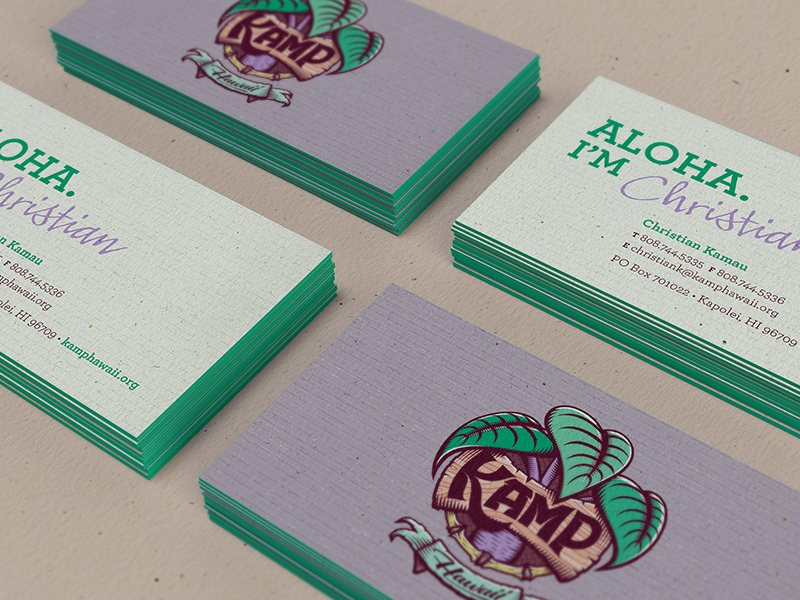
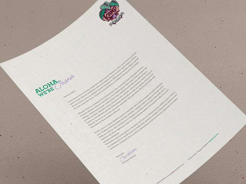
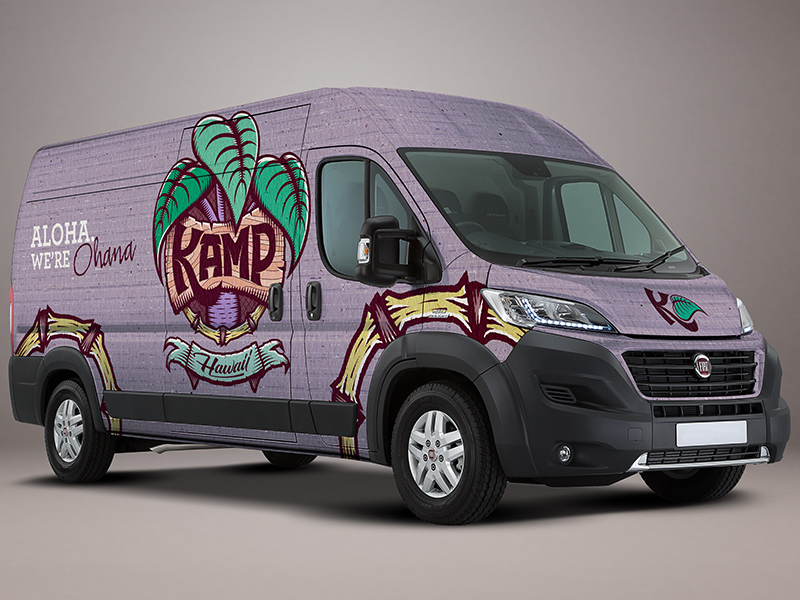
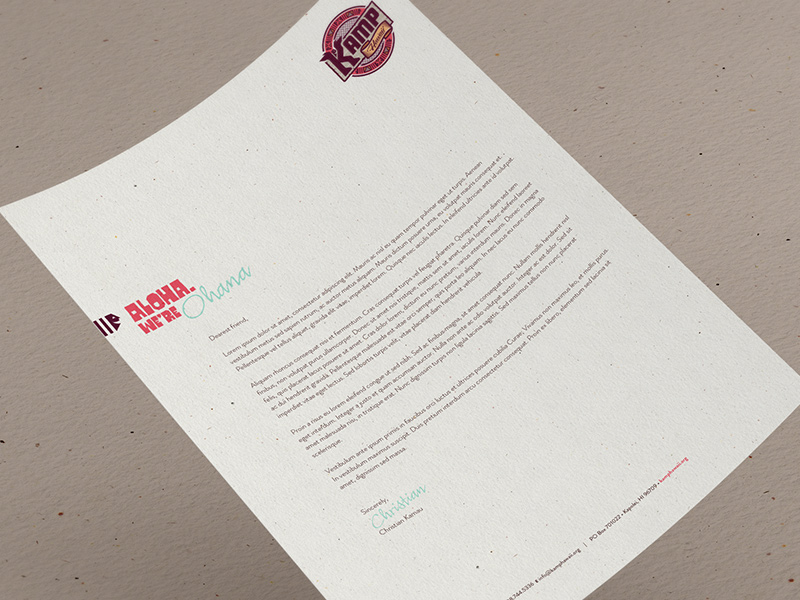
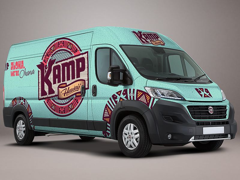
A tagline was created for branded elements which reads, "Aloha. We're Ohana." This translates to "Hello. We're family." The concept of family, including blood-related, adoptive or intentional, is central to Hawaiian culture. As a tagline for KAMP, it suggests that the organization is an extension of family to disadvantaged youth.
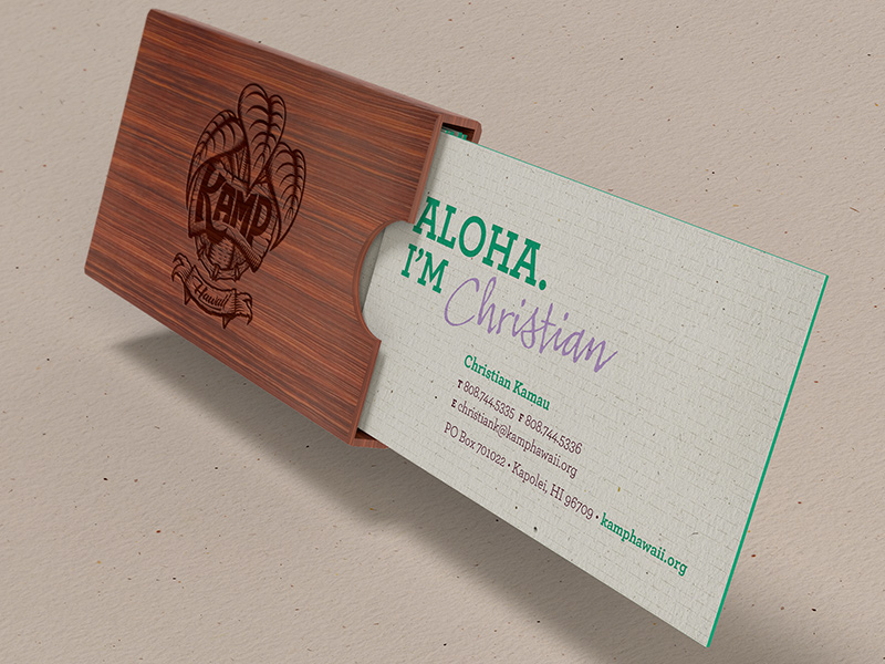
Stationery system.
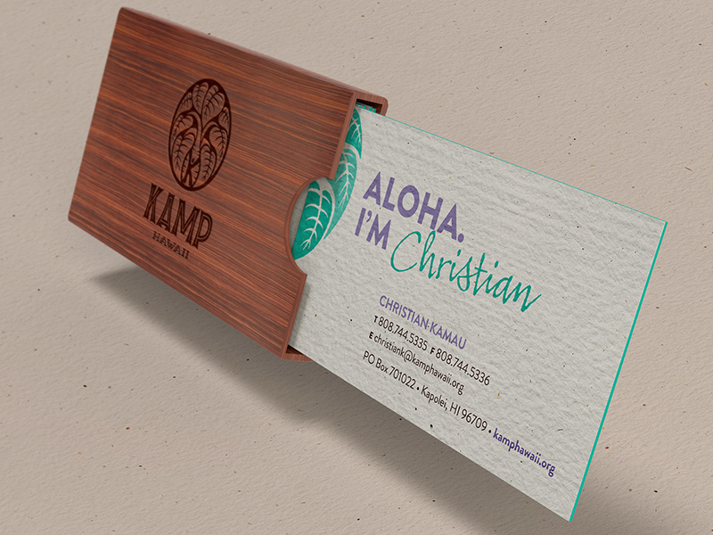
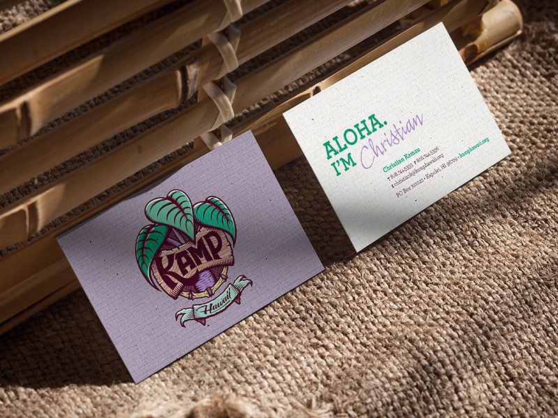
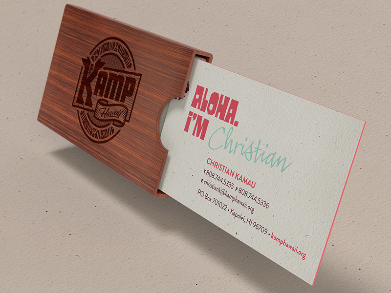
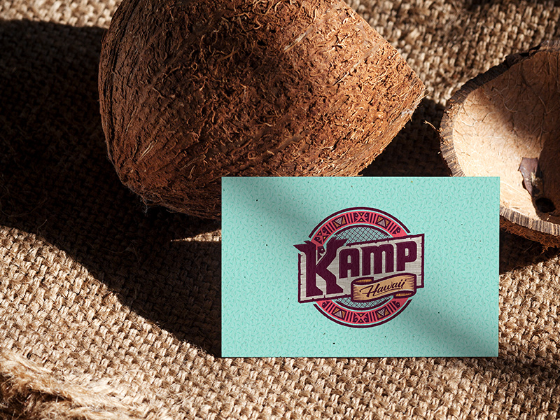
Business card and laser-etched Koa wood business card holder.
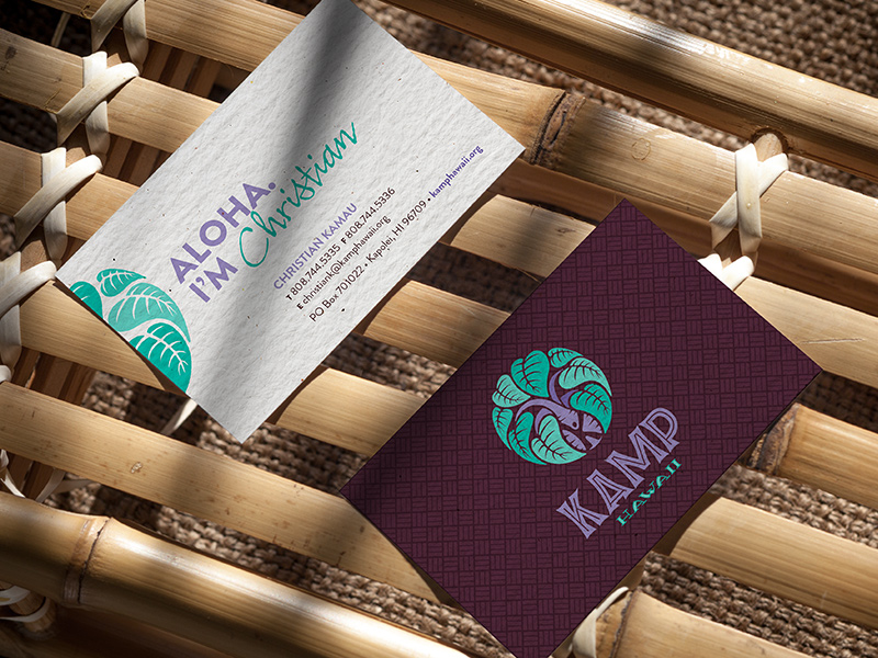
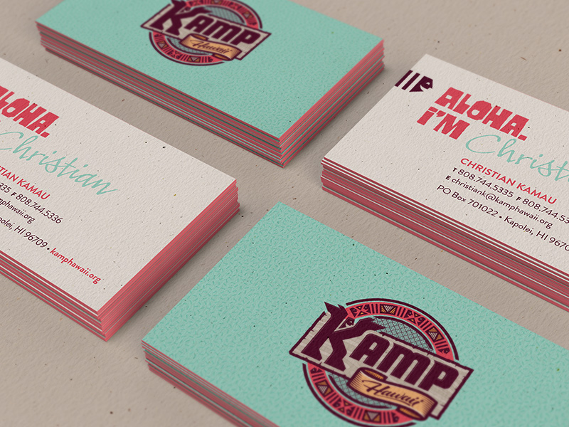
Business cards.
Letterhead.
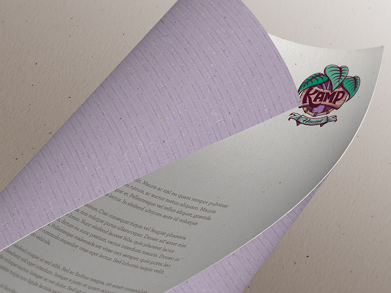
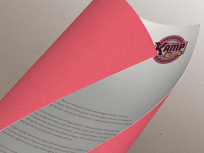
Letterhead back and front.
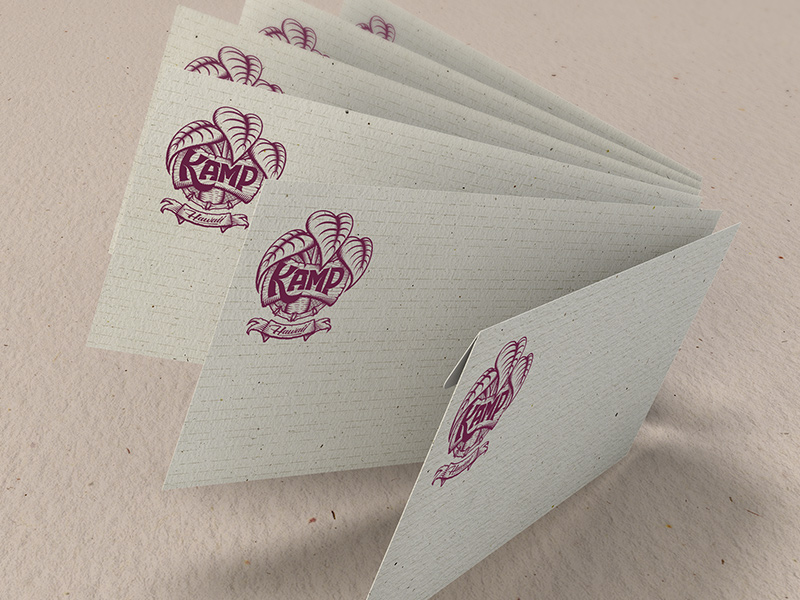
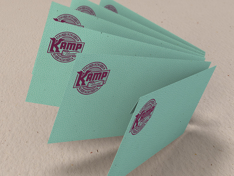
Envelopes.
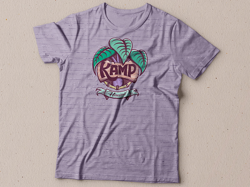
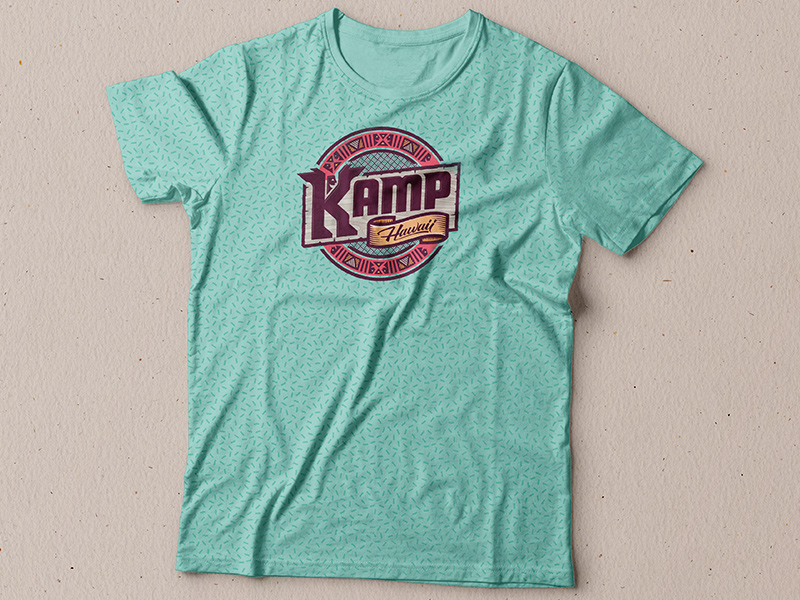
T-shirt.
Shuttle van.
Business cards.
Unused proposal 01
Rationale
This concept again uses the Kalo imagery, but employs a more straightforward, illustrative approach. It is rich with detail and texture, and has a strong natural and organic aesthetic, which symbolizes native Hawaiians' symbiotic relationship with nature.
The main colors, green and violet, are symbolic of Kalo leaves and root, respectively, however the particular hues used here are stylized, modern, and fresh. Further, the main background texture, which is actually a seamless pattern, is meant to suggest the color and texture of a Kalo root.
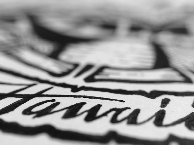
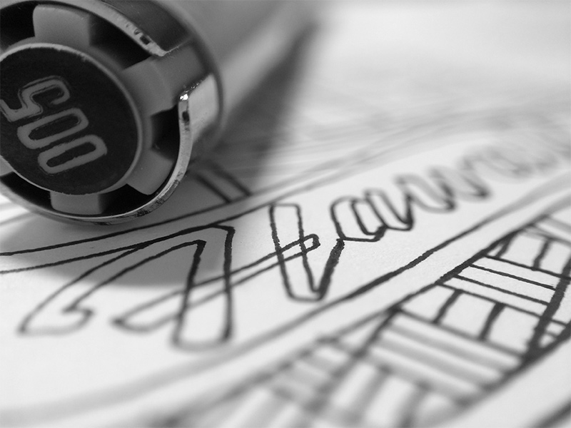
Logo development process
Unused proposal 02

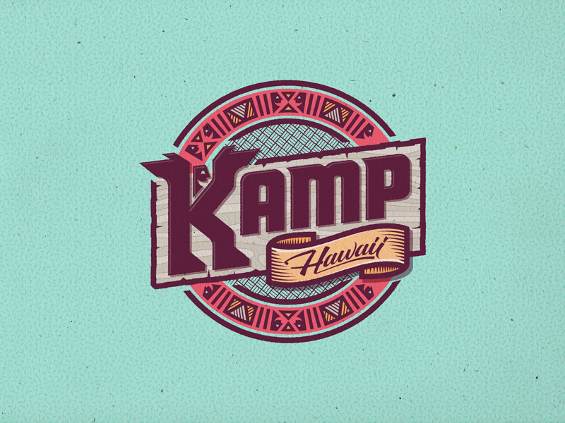
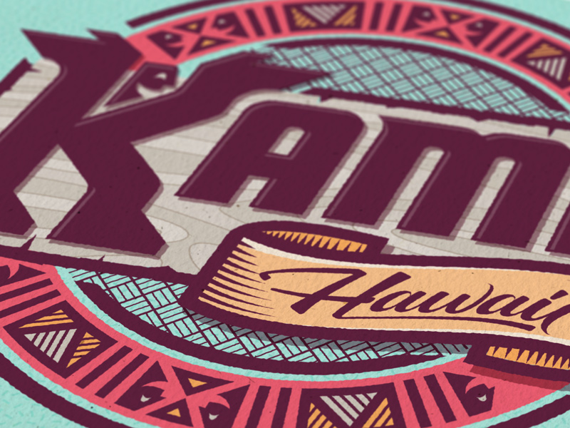
Rationale
This concept does not feature a Kalo plant, but rather focuses on visually depicting the uplifting, communal aspect of the organization. Here, the K-character represents the nurtured child, while the smiling faces encircling the mark in the border (a nod to Polynesian tribal patterns) symbolize the spiritual and loving sense of togetherness and family that is at the core of every native Hawaiian person.
The main colors, light blue and salmon, are bright, youthful, and uplifting, and are symbolic of the crystal clear waters of Hawaiian beaches and the vibrancy of coral reefs, respectively.
Logo development process
What do you think?
atomicvibe would love to know your thoughts on this project!