

brand strategy
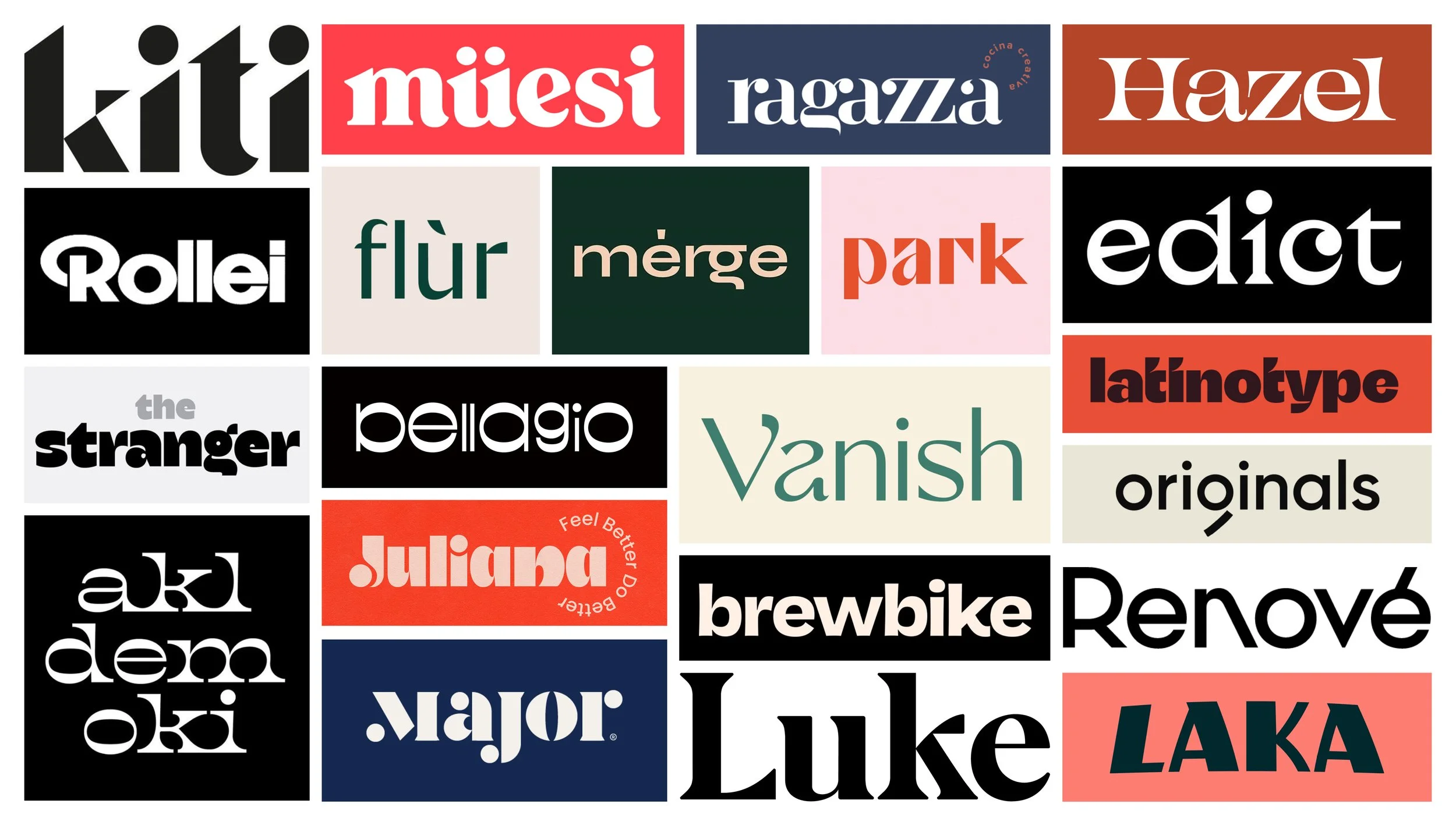
visual identity
tagline development
copywriting & messaging
tone of voicE
brand guidelines
From Spark to Strategy.
Great ideas are only the beginning.
For 23 years, Ninth Edge, a leadership training company in Chicago, IL, has helped leaders sharpen their skills, navigate complexity, and drive meaningful change. Founded by two partners with 27 years of leadership training experience each, the company built a reputation for delivering impactful programs for organizations like Abbott, AbbVie, Billtrust, Conagra, and Discover. But while their work spoke volumes, their brand did not.
Despite their success, Ninth Edge lacked a cohesive identity, a defined voice, and a brand strategy that reflected their influence in the field. Now, they were ready to turn their expertise inward — transforming from a trusted training partner into a leadership brand in its own right.
The challenge was clear: to reimagine Ninth Edge with a brand as sharp, strategic, and insightful as the work they do. This rebrand centers on the belief that effective leadership is both an art and a science, requiring a balance of boldness and precision.
Because in leadership, it’s not just what you say, but how you say it.
moodboards
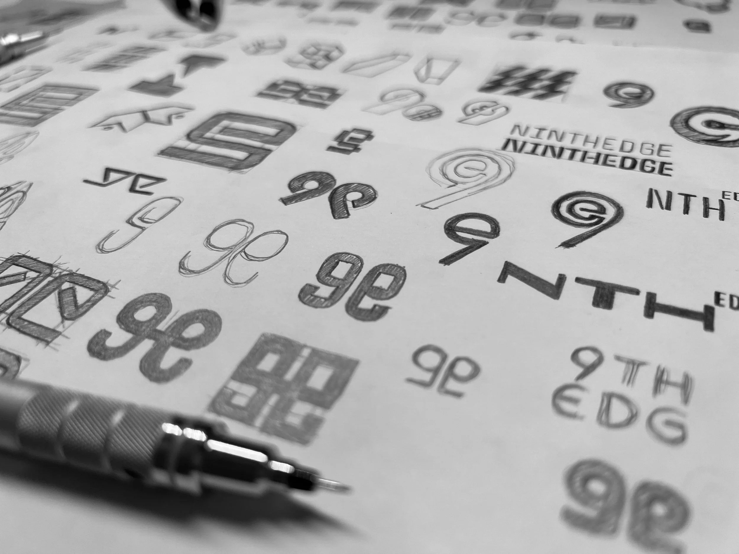
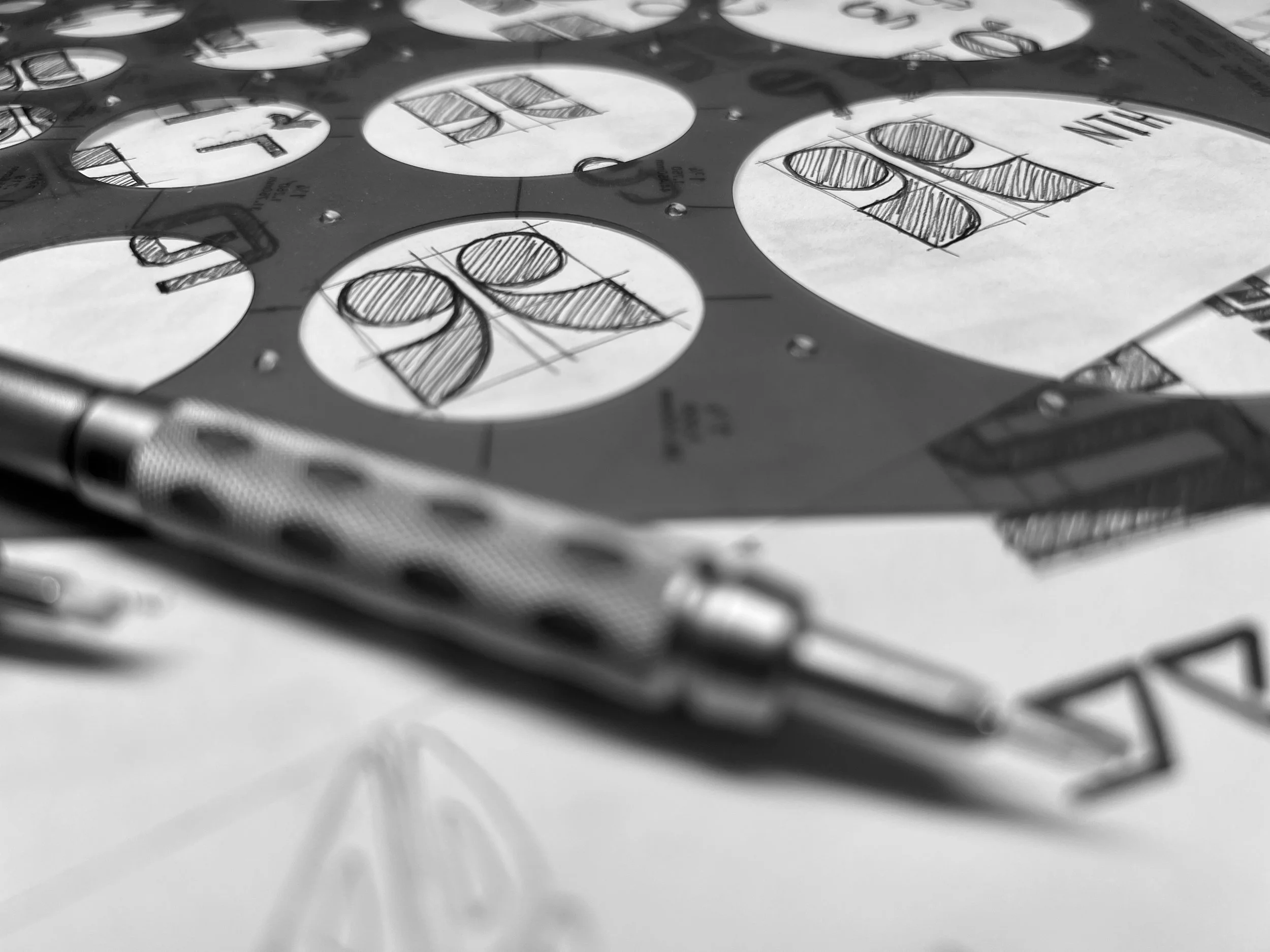
Sketches
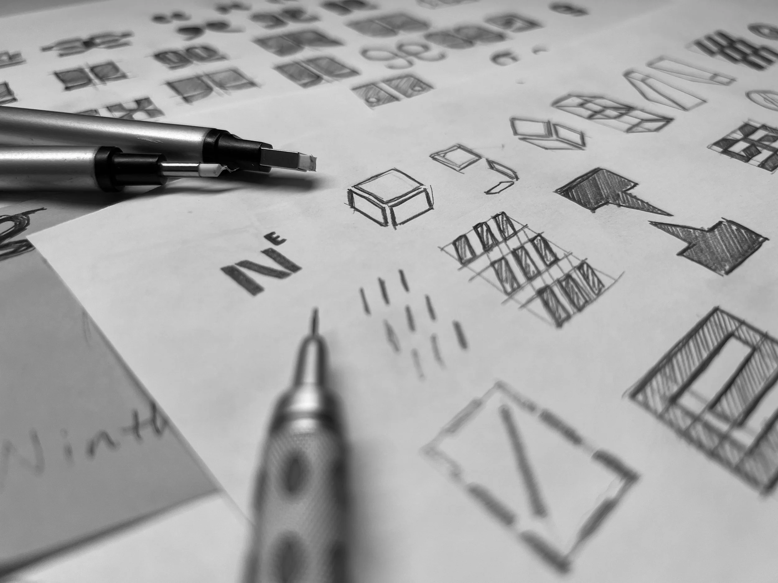
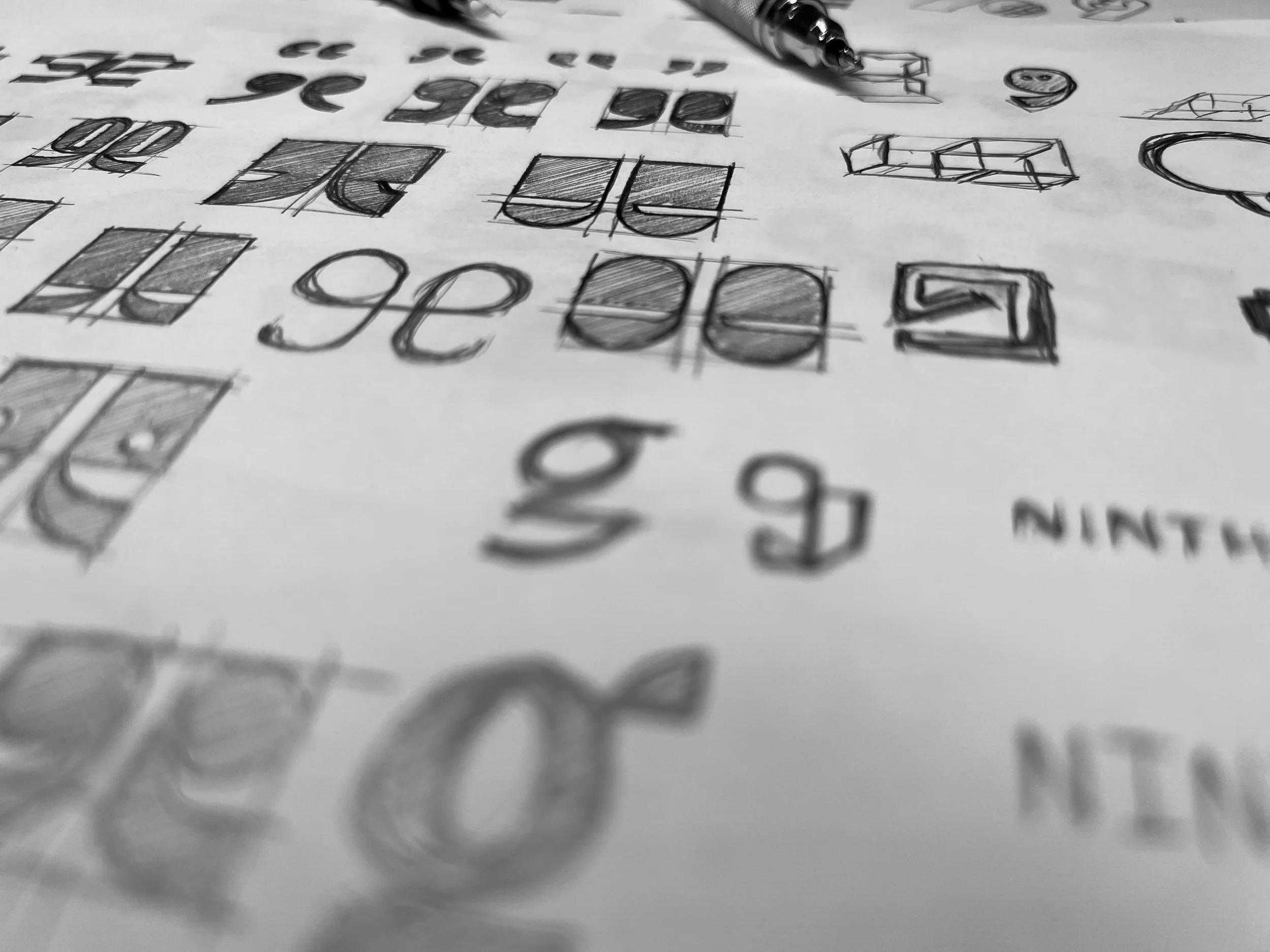
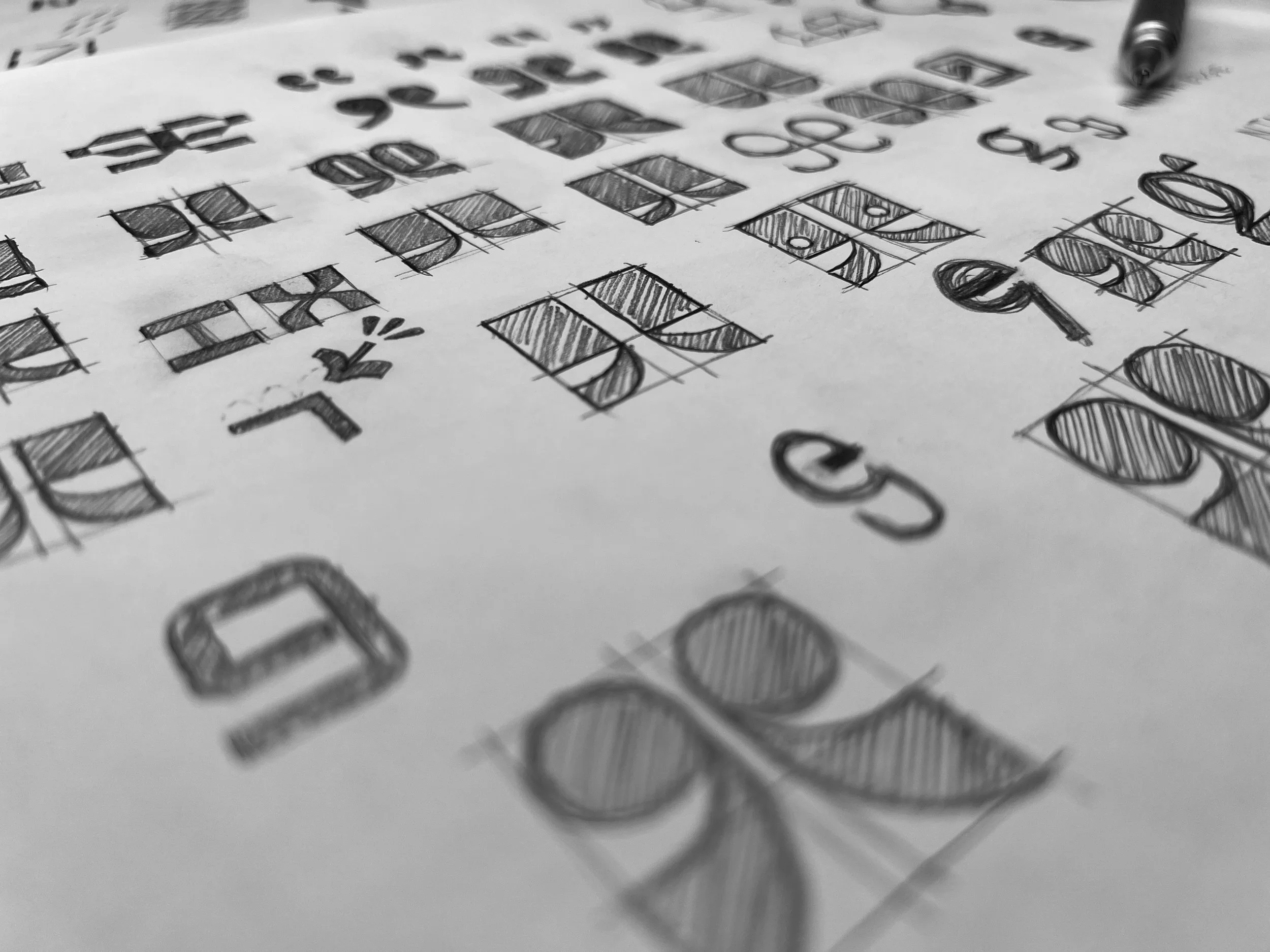
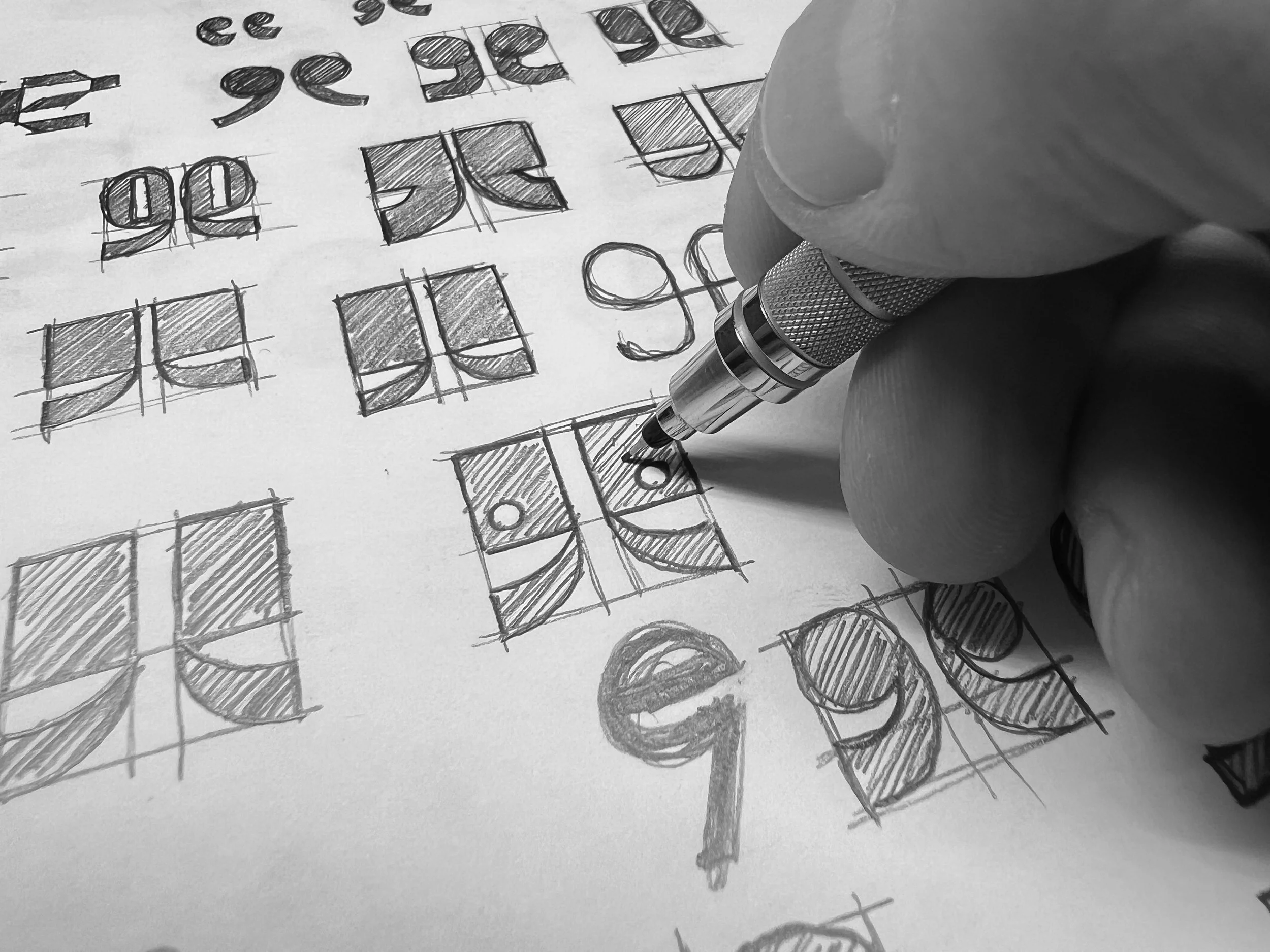
Brand Idea
Leading with conversations.
The path to progress starts with better conversations.
At the heart of Ninth Edge is a simple yet powerful idea:
Better conversations lead to better leadership.
This belief informs every aspect of the brand, from training sessions to visual identity. Leadership is as much about communication as it is about strategy, and great leaders emerge through meaningful dialogue with their teams. Professional teams that communicate effectively create stronger connections, which lead to better working relationships and improved outcomes.
Visual Identity
Form, function, and flair.
Crafting leadership in every curve, color, and line.
The Ninth Edge visual identity is a sophisticated blend of design elements, all crafted to reflect the brand’s commitment to intelligent, impactful leadership, and the pursuit of better, more meaningful conversations. But beyond looking the part for corporate audiences, the brand carries a distinct personality — one rooted in the dynamic energy and engaging presence of its founders, Greg Miller and Kyle Courtaway. Their unique styles of leadership and presentation informed key aspects of this identity, ensuring that the brand isn’t just professional, but also vibrant, human, and memorable.
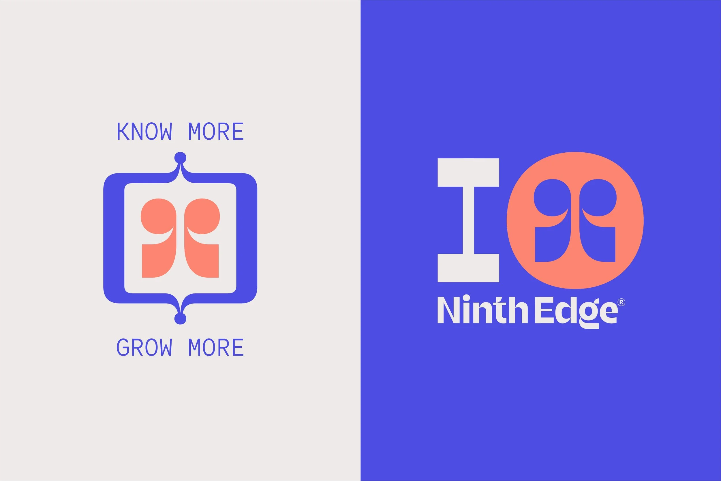
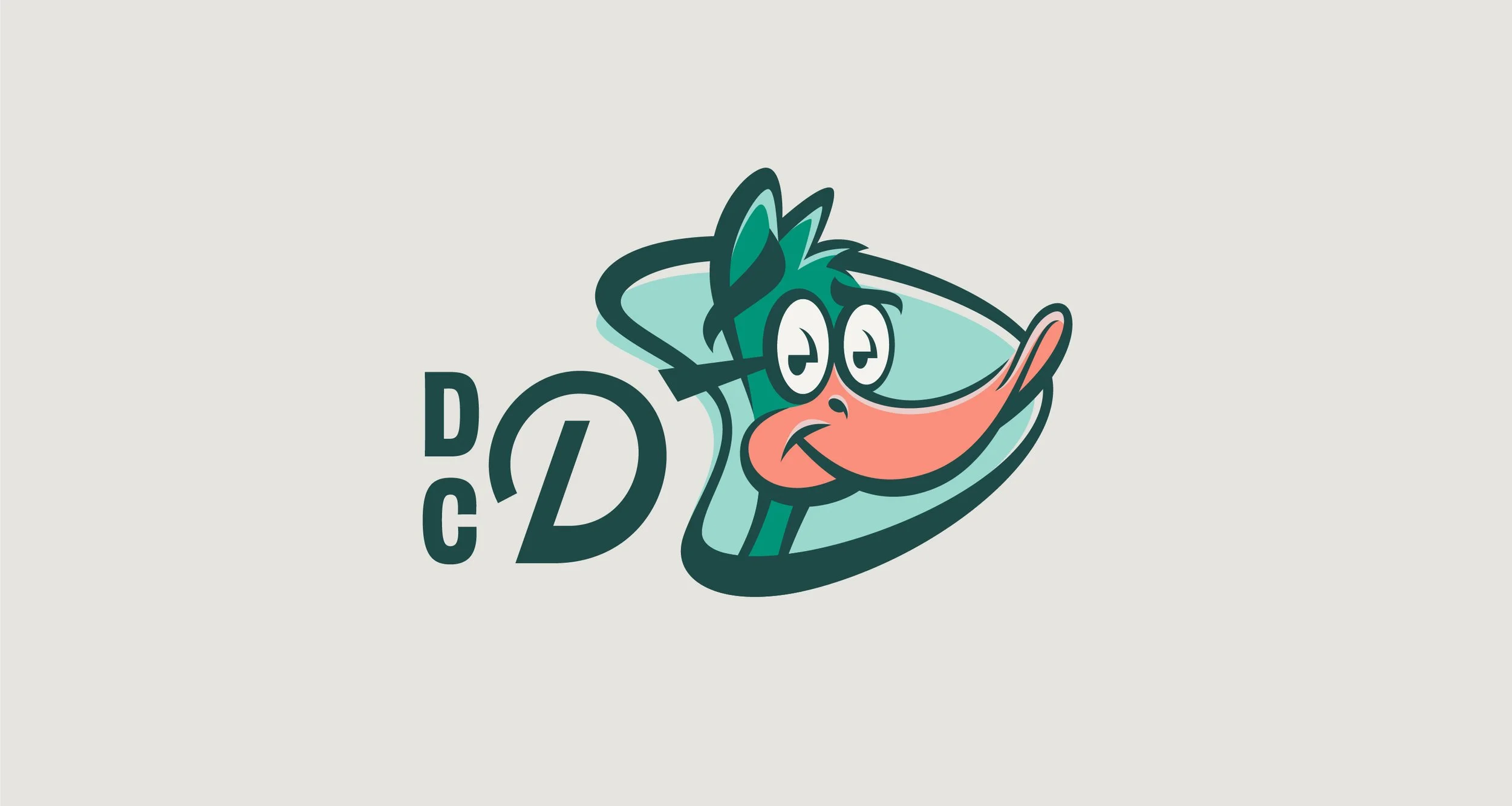
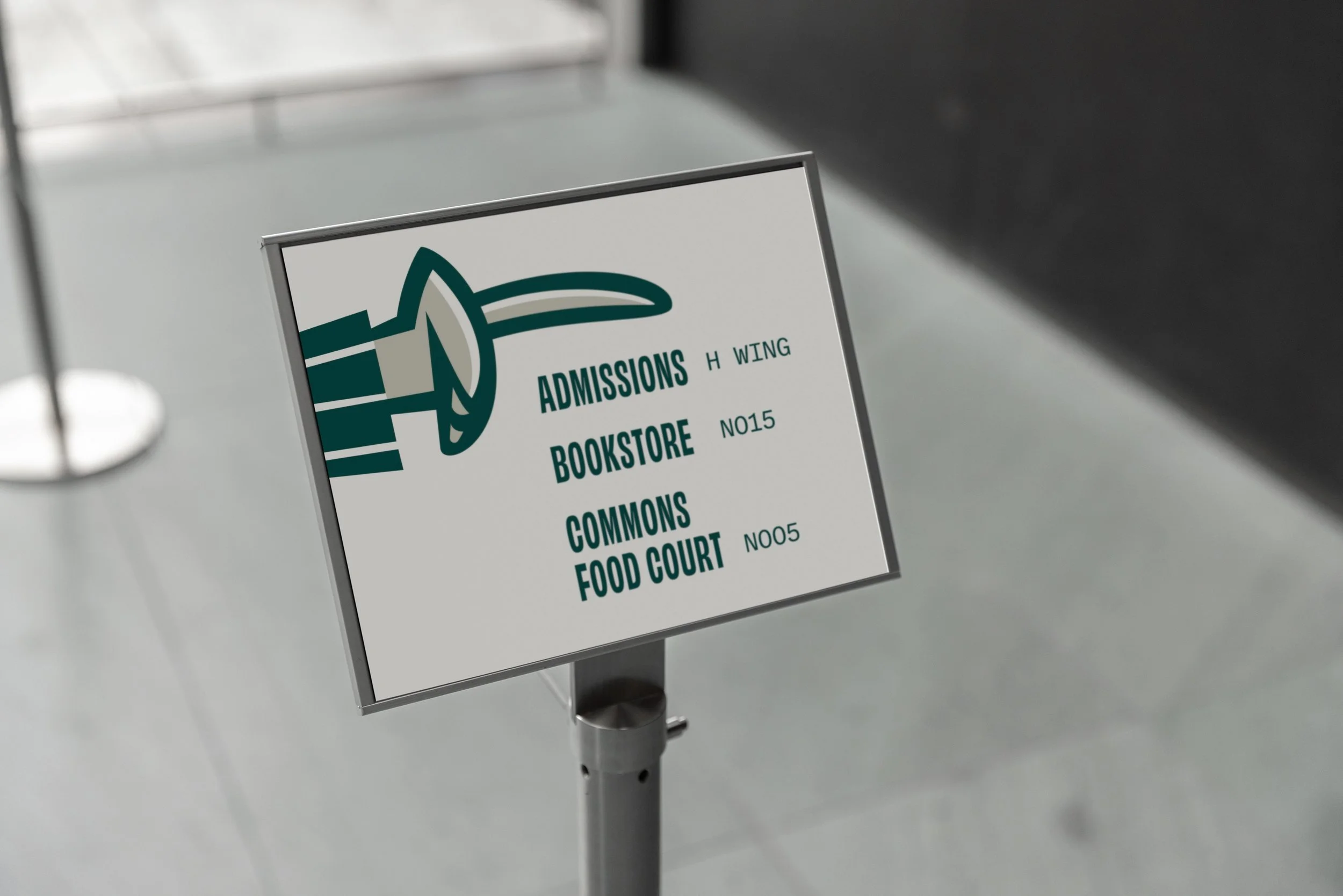
At the heart of this identity is the custom logomark and logotype, both meticulously designed to embody the dualities inherent in effective leadership — bold yet thoughtful, dynamic yet grounded.
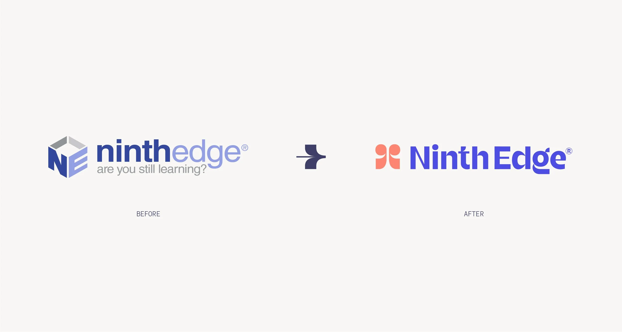
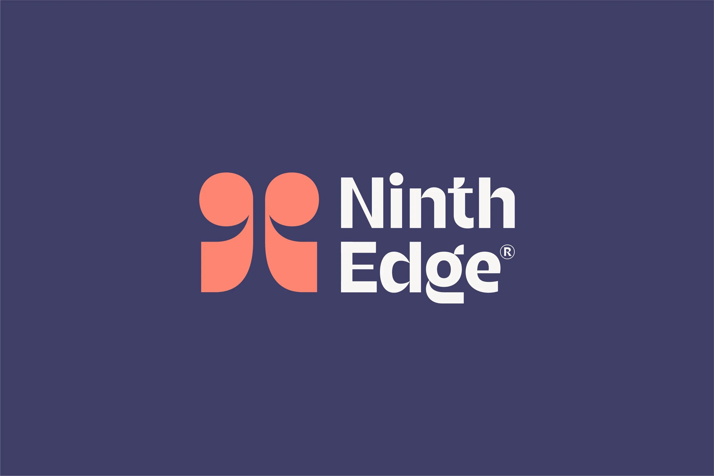
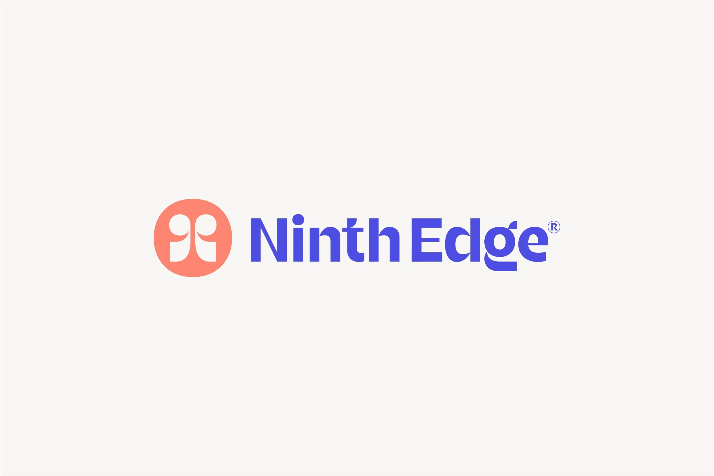
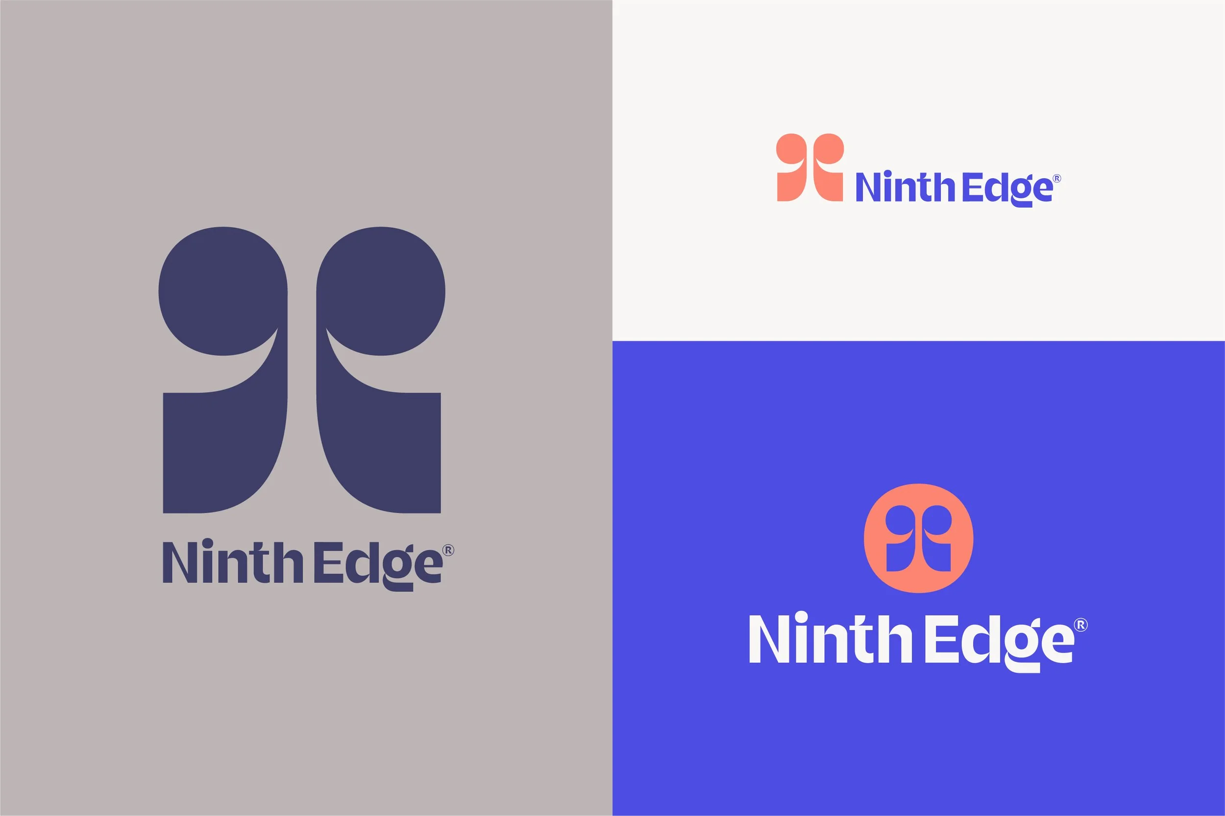
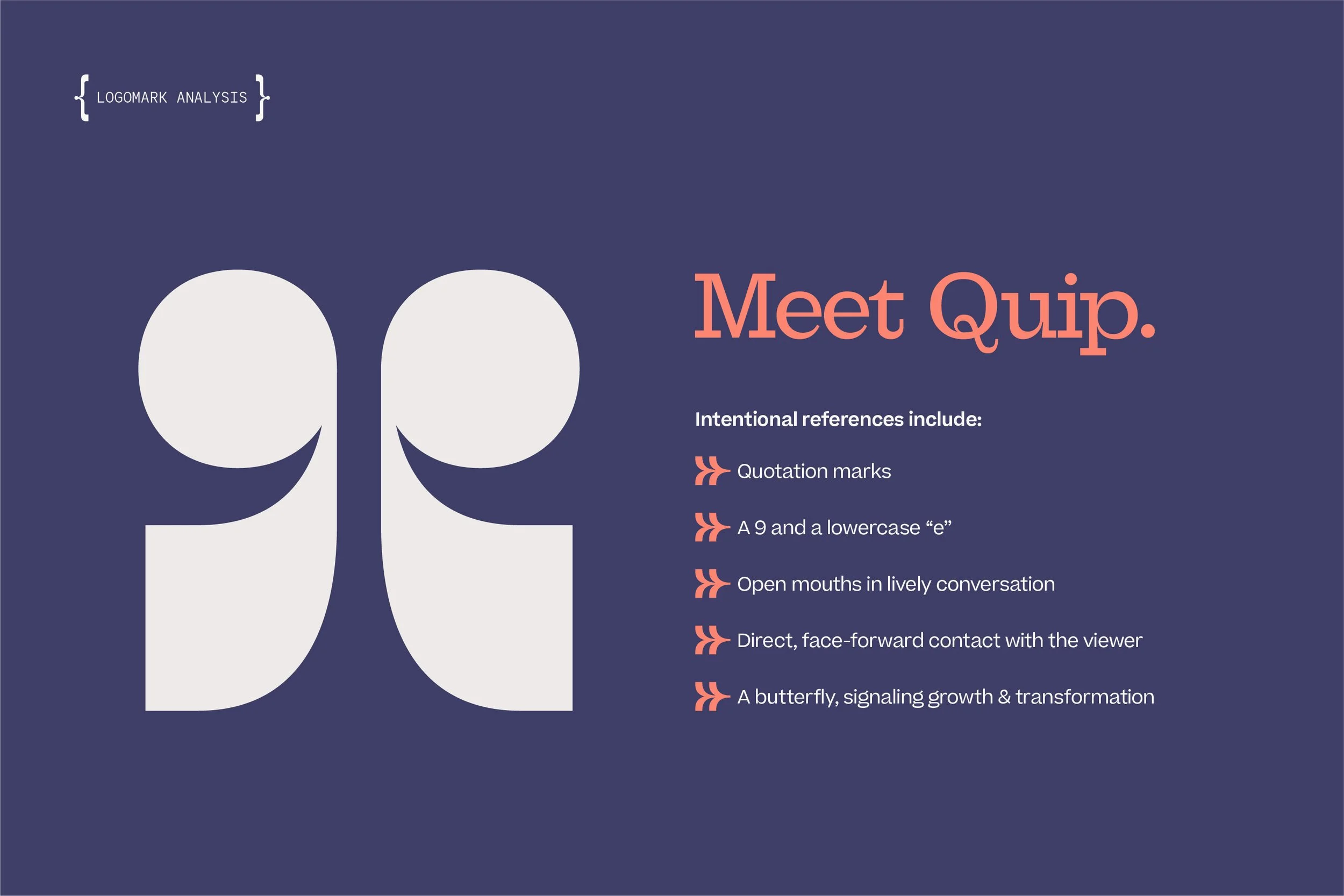
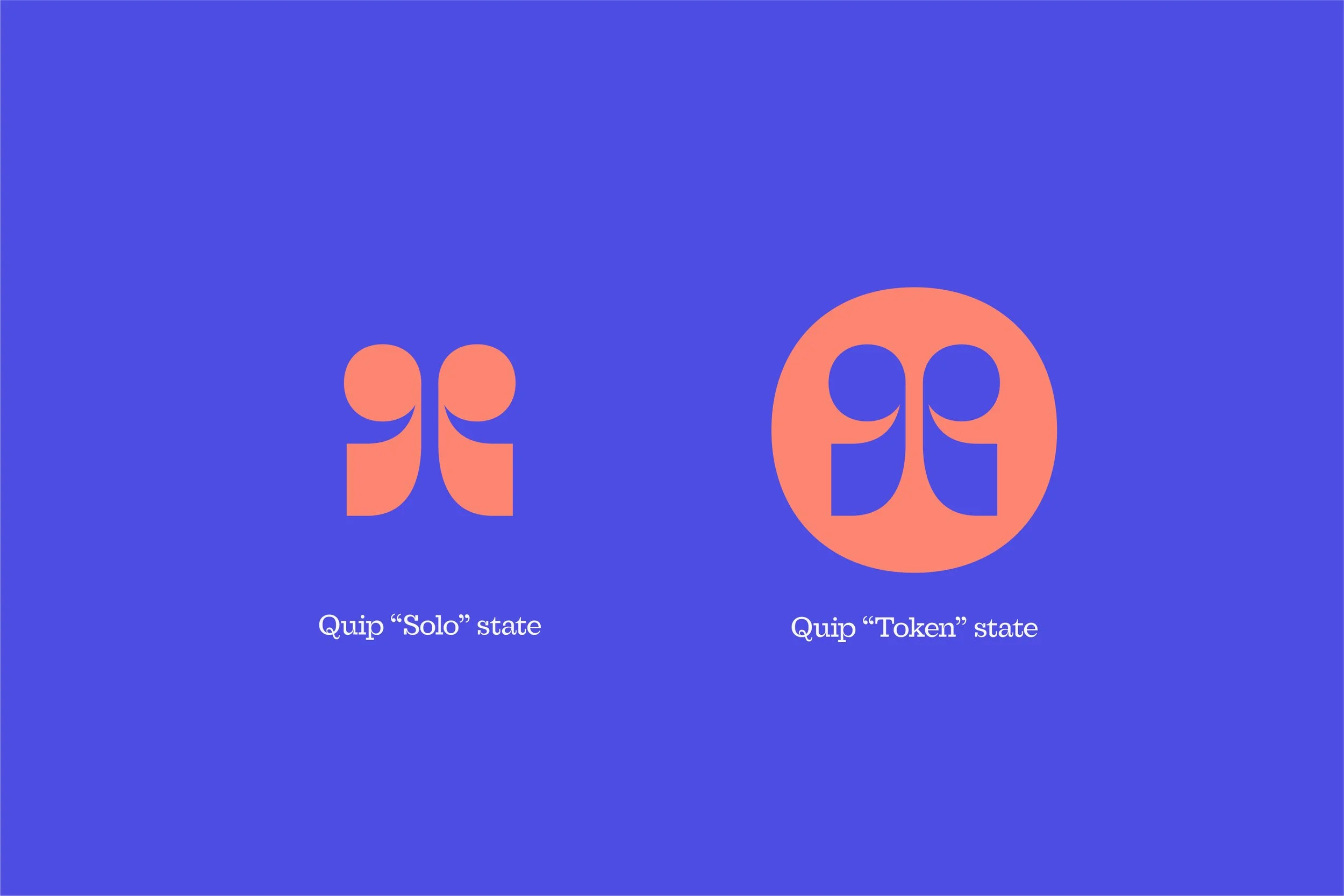
The logomark, affectionately named “Quip,” is a direct reflection of Greg and Kyle in action. Inspired by the transformative power of conversation, Quip takes cues from quotation marks and a butterfly, representing the interplay of dialogue, growth, and progress. Its multidirectional form echoes the fluid, responsive nature of great leadership, much like the way Ninth Edge fosters impactful discussions that drive real change.
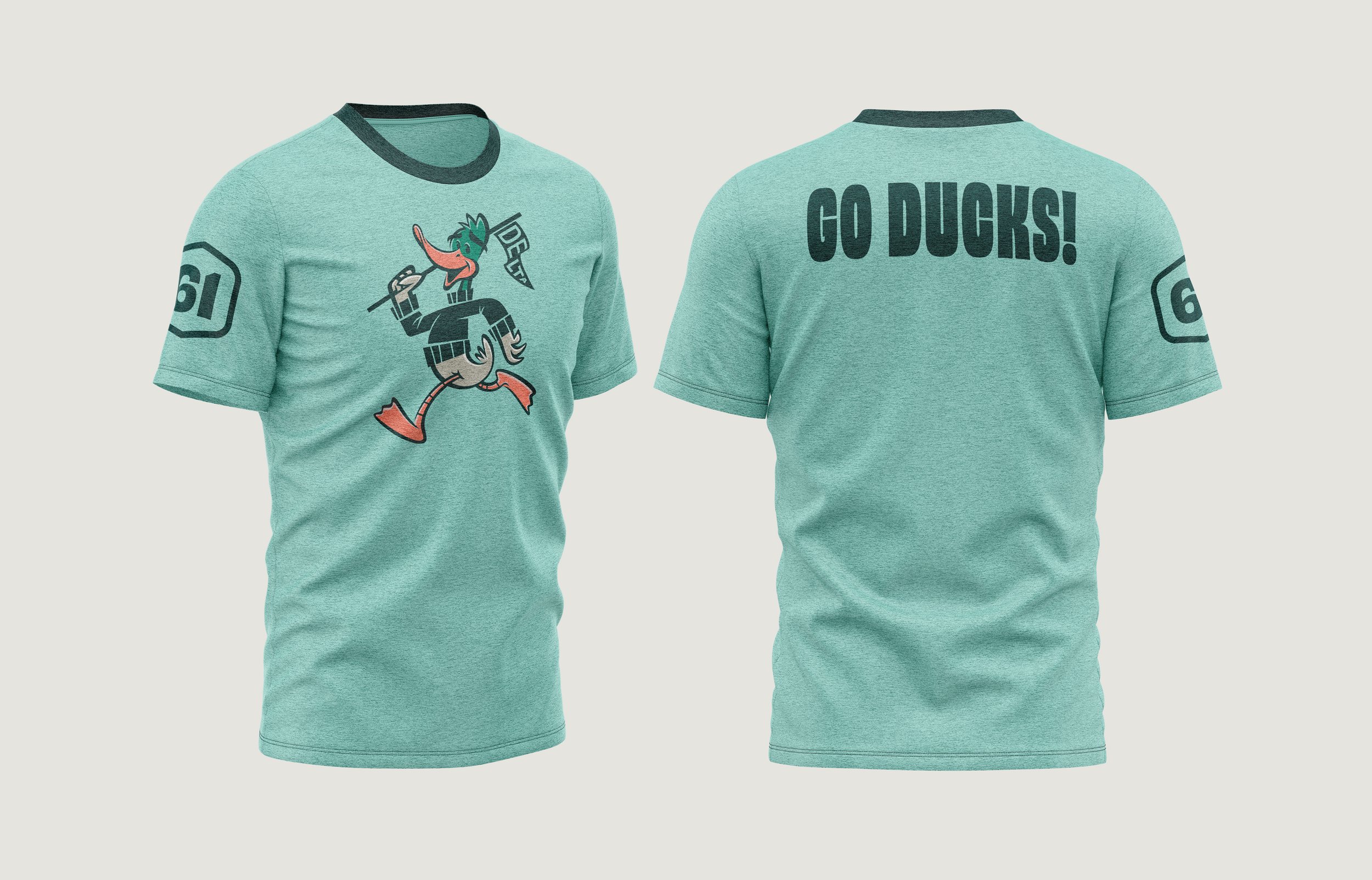
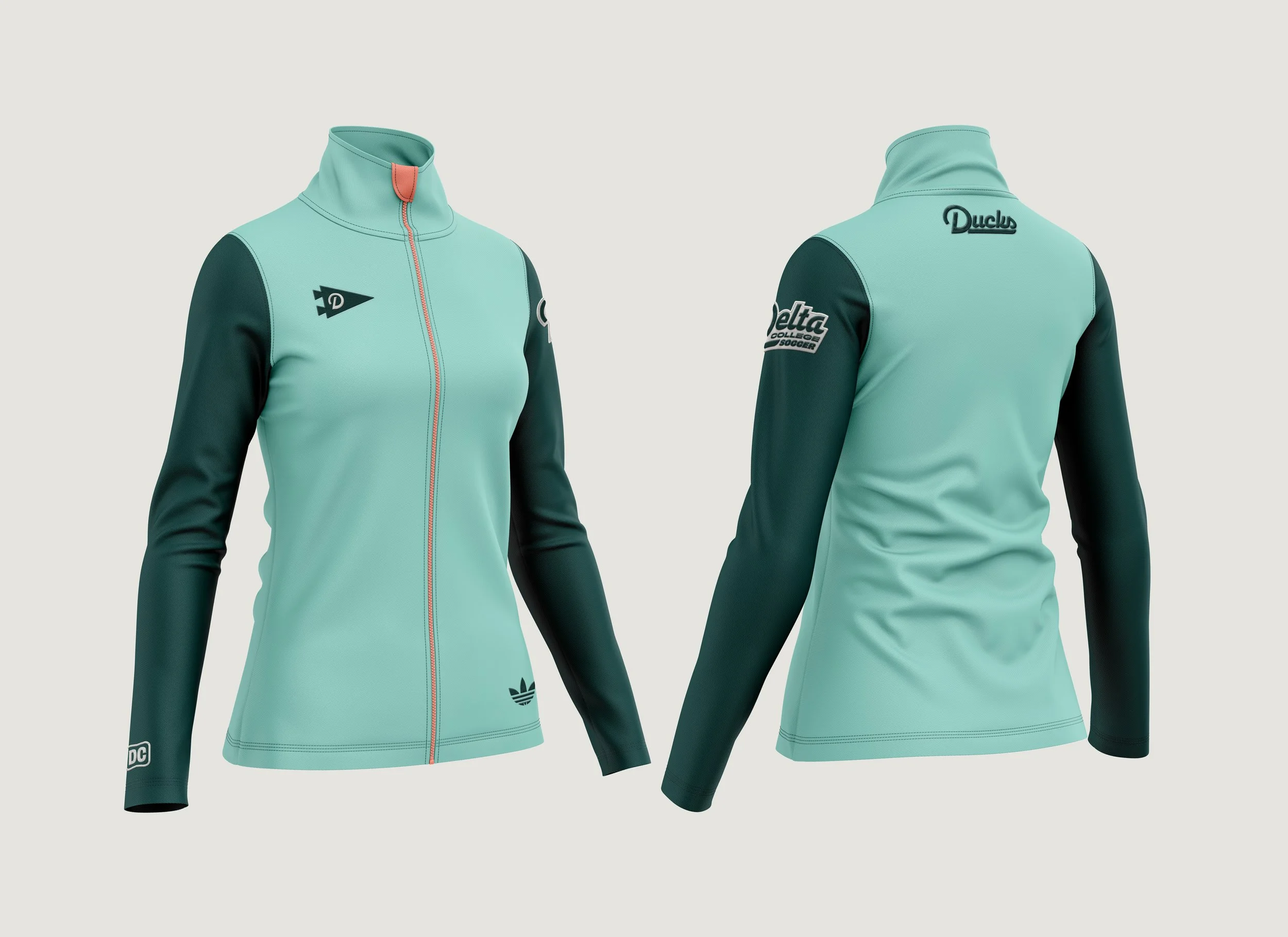
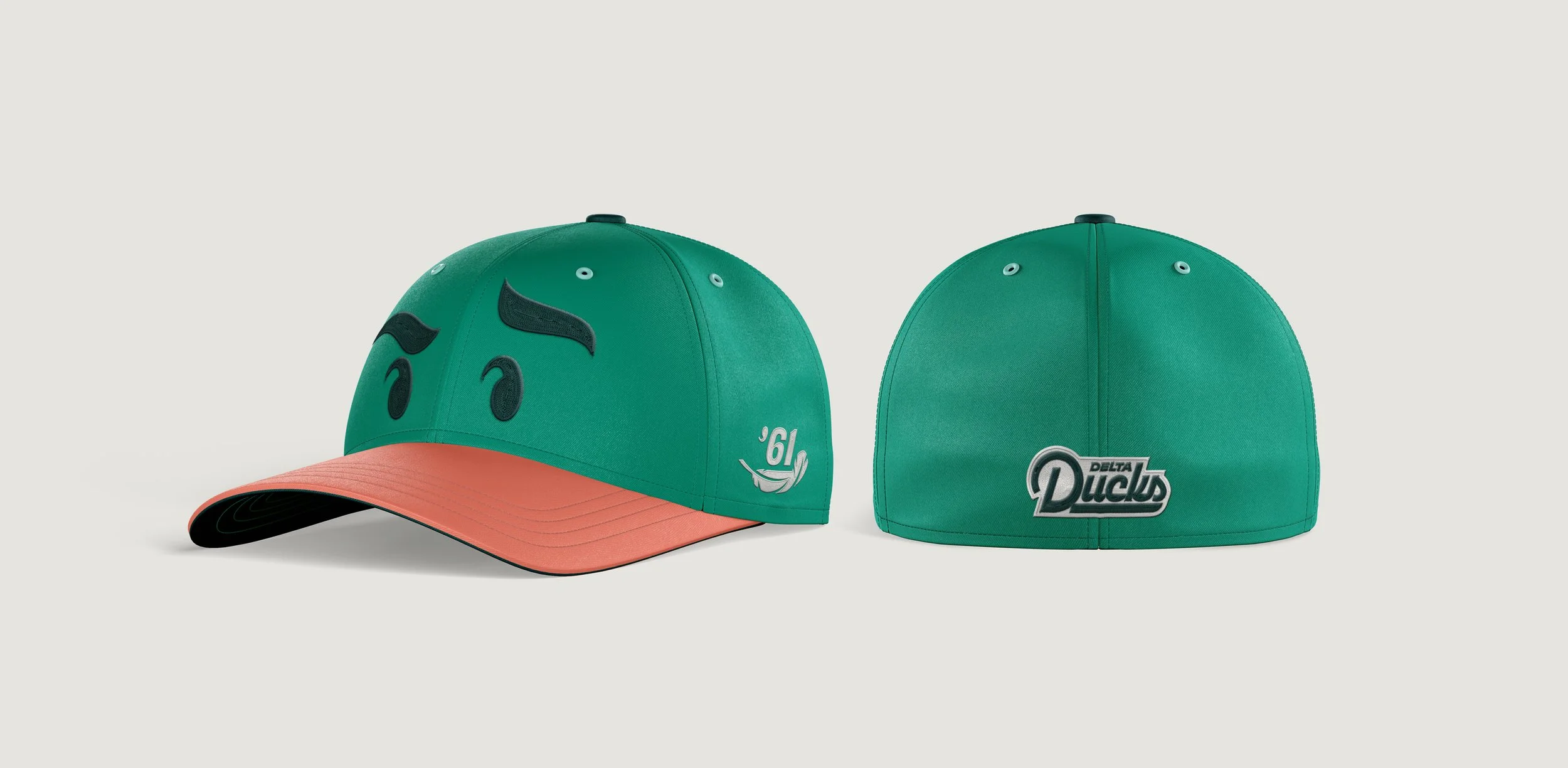
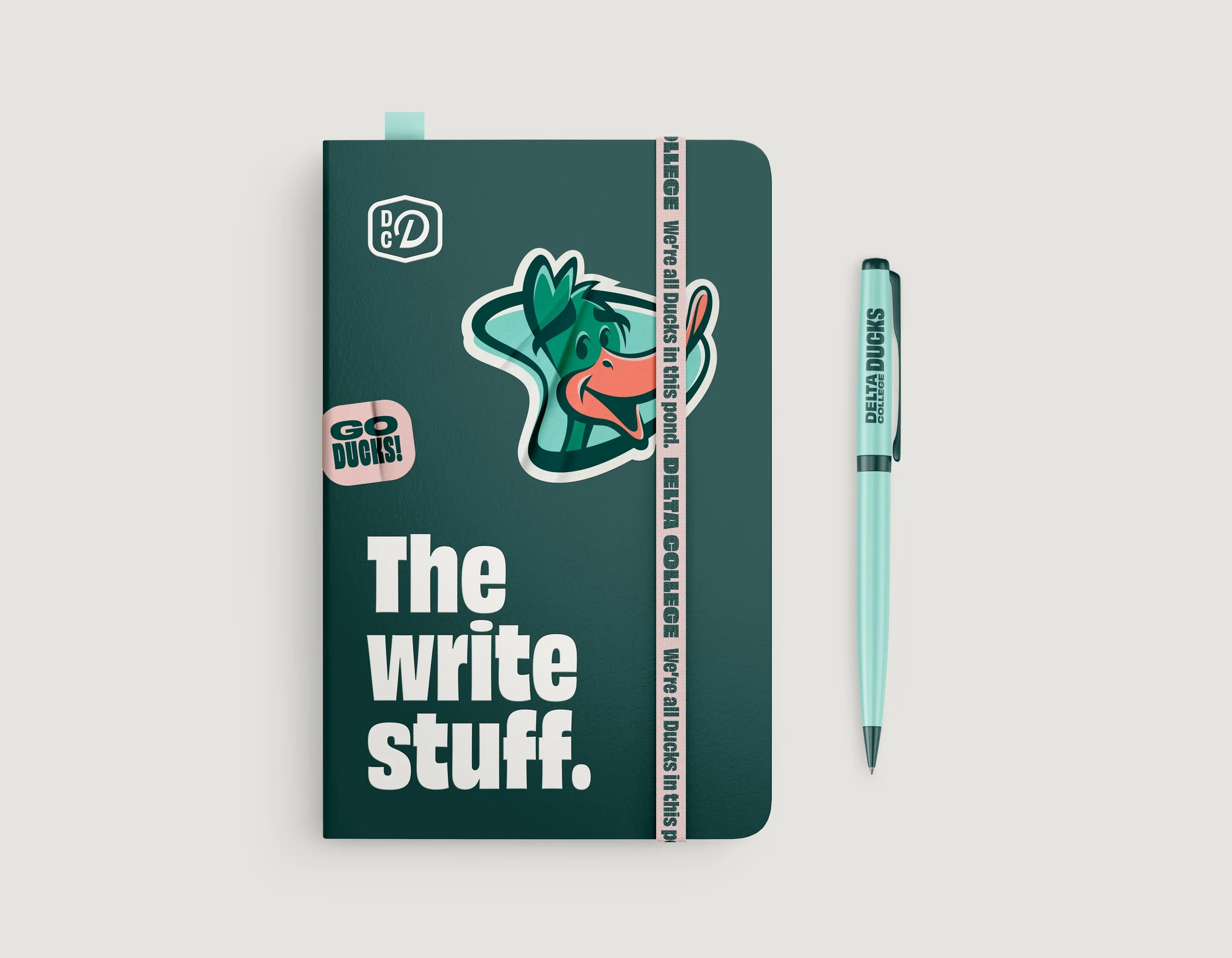
The color palette enhances this nostalgic yet modern appeal. These colors, combined with Duck’s playful and bold character designs, create a visual identity that is both timeless and relevant, reflecting Delta College’s dynamic spirit and rich heritage.

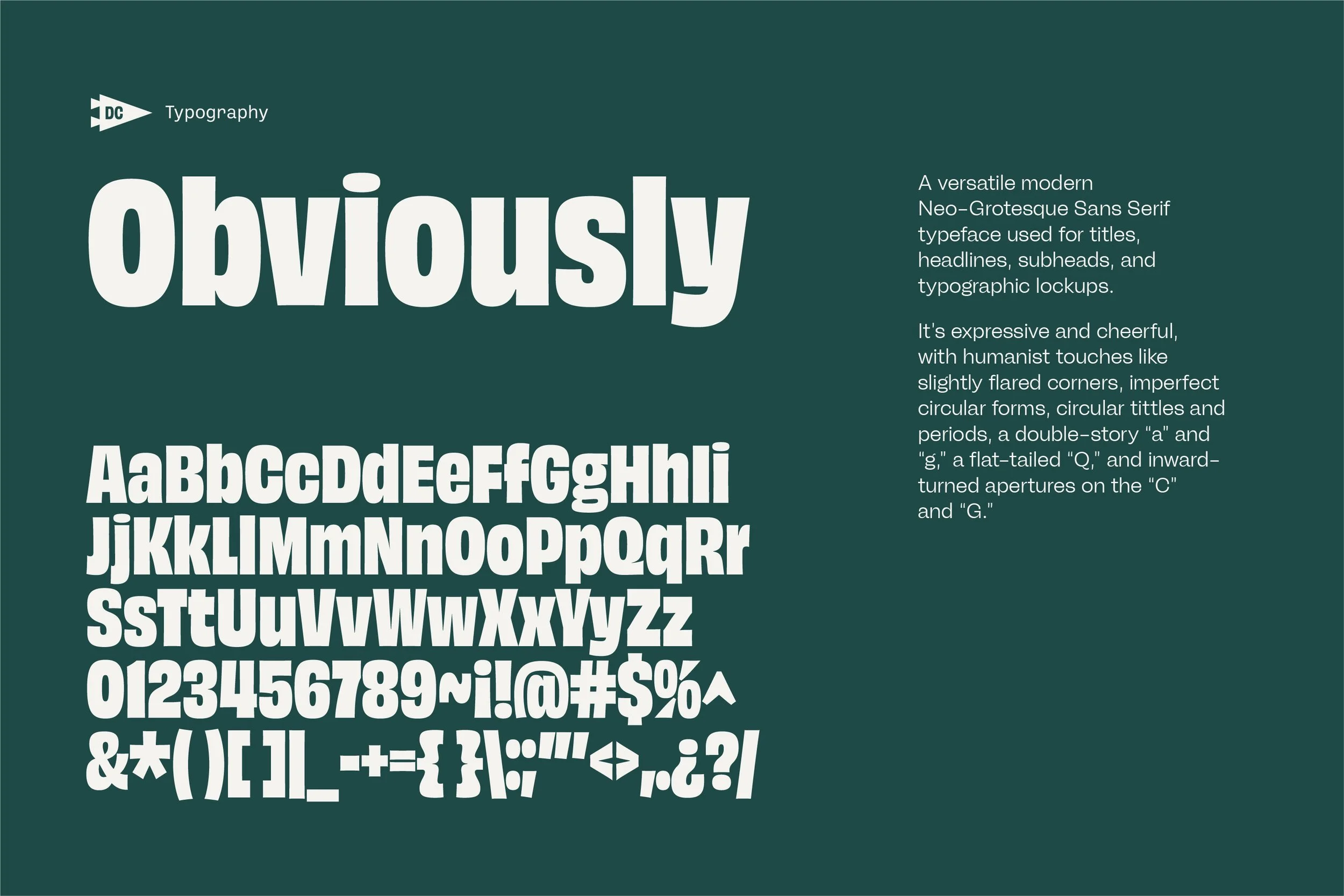
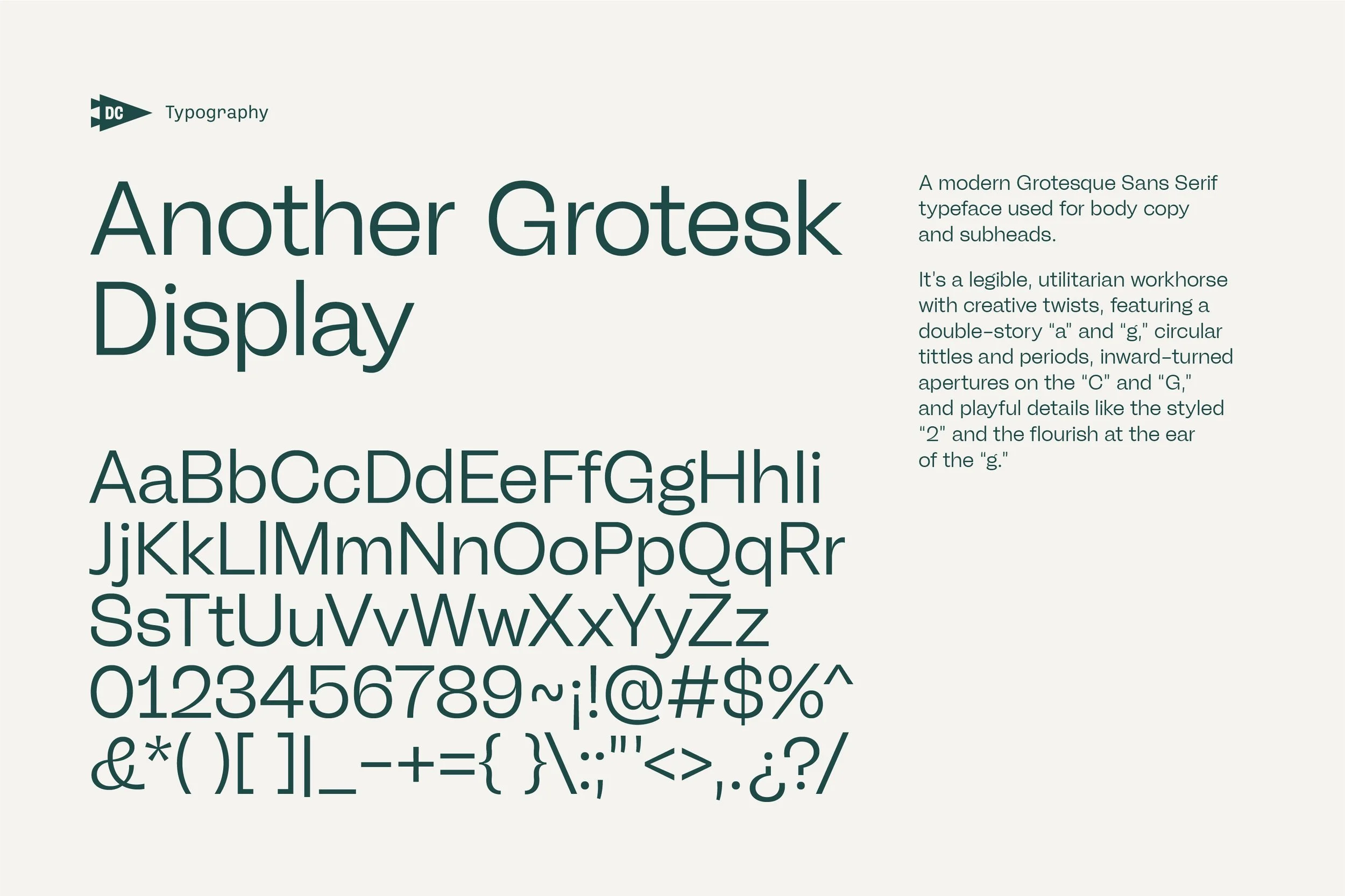
The typefaces play a crucial role in the brand’s visual identity.
Obviously is a versatile Neo-Grotesque Sans Serif used for titles, headlines, and typographic lockups, known for its expressive, humanist touches.
Another Grotesk Display, a modern Grotesque Sans Serif, is the workhorse for body copy and subheads, with creative details like the styled “2” and the flourish at the ear of the “g.”
Ballinger Mono, a monospaced Grotesque Sans Serif, is used sparingly for a technical look, and is ideal for data representation and specific label types, echoing the aesthetics of the other typefaces.


Mission and Impact
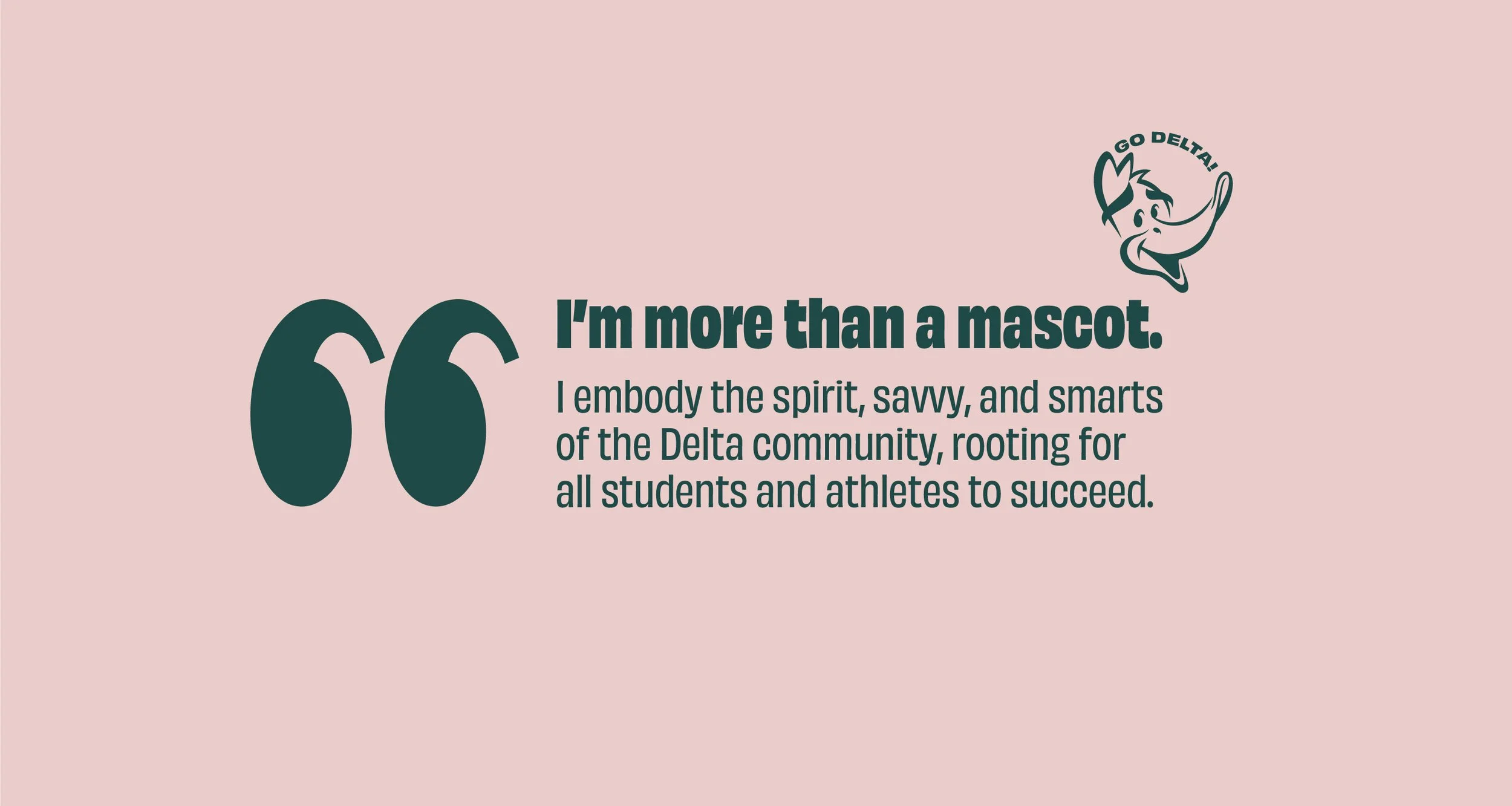
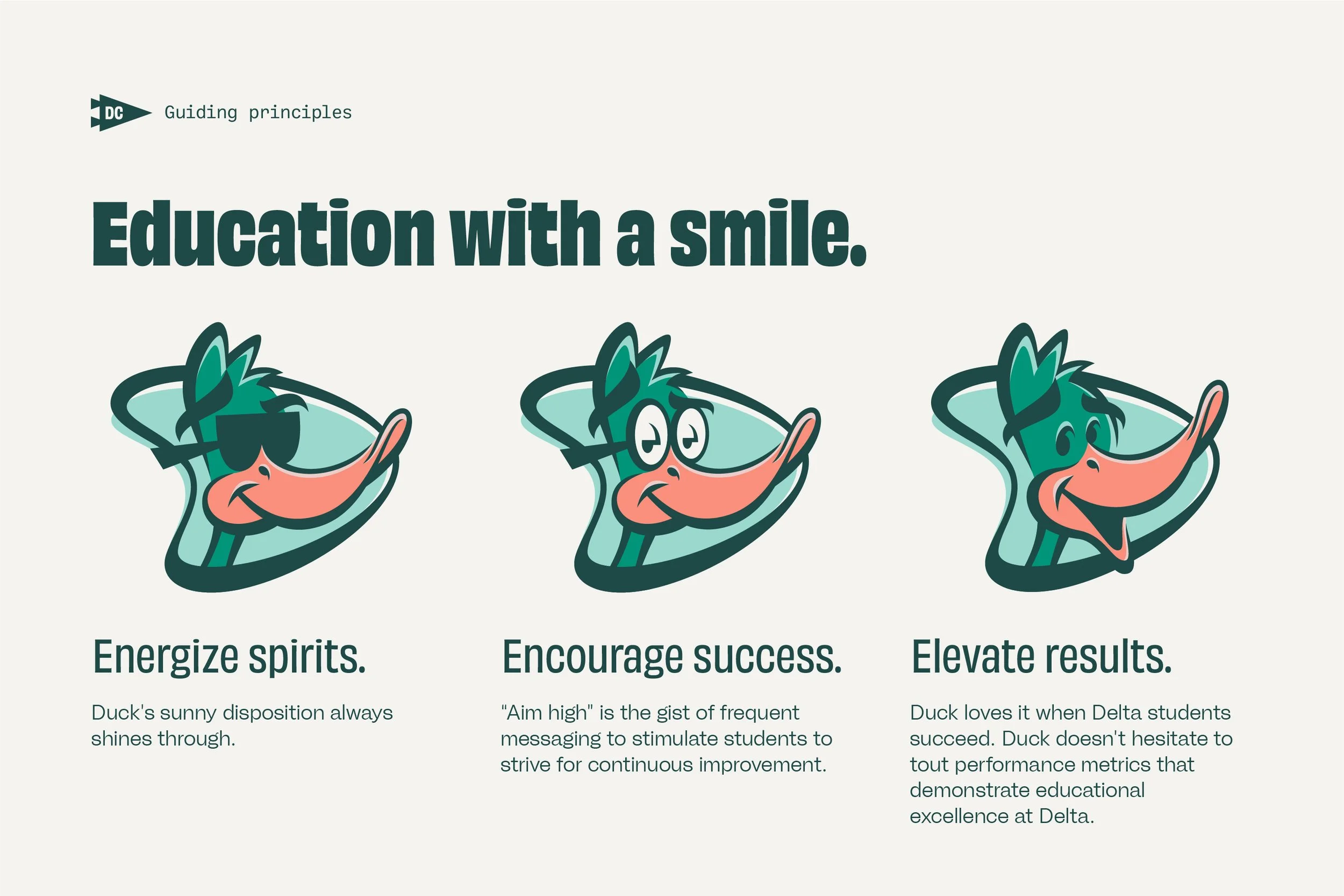
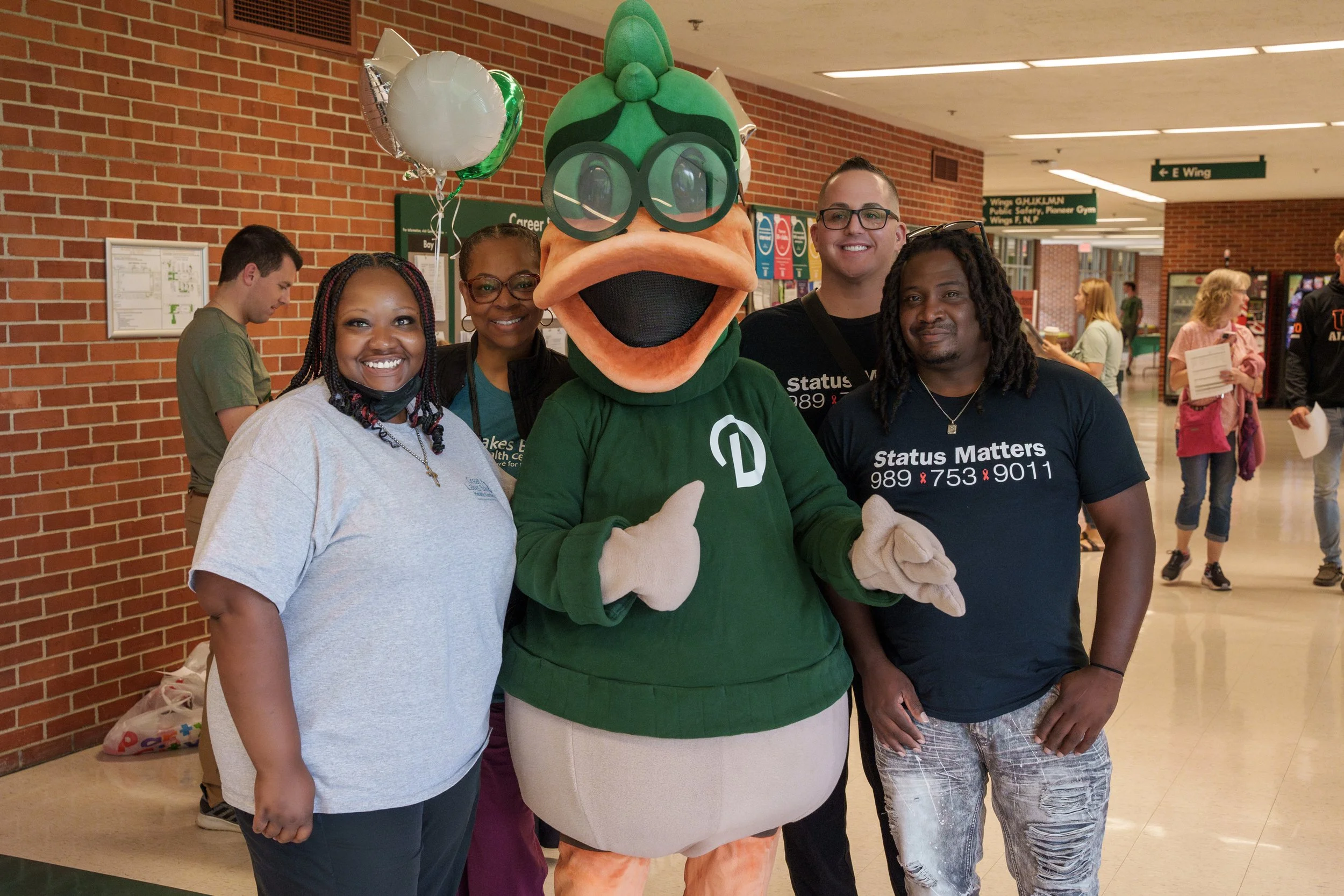
More than a mascot.
An encouraging, feathered friend.
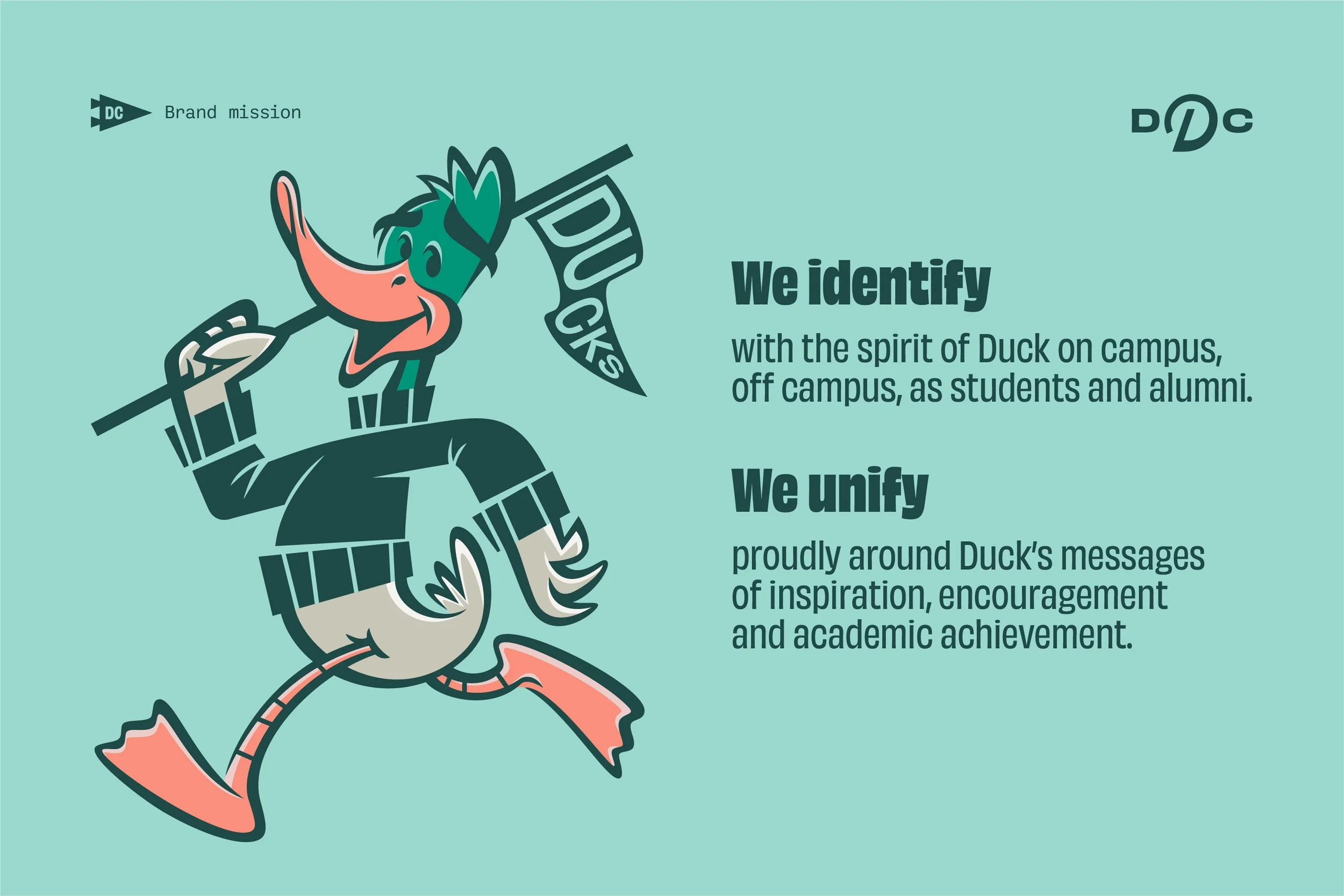
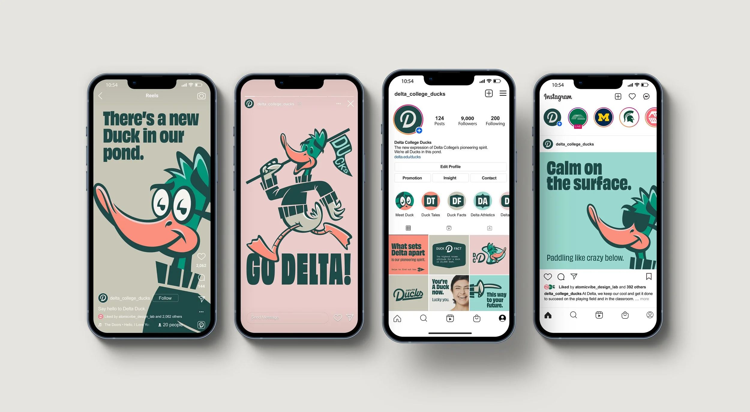
Duck’s mission goes beyond being a mere mascot. As Delta’s Dean of Community, Duck rallies the student body toward academic and athletic success. By infusing every campus communication with encouragement and enthusiasm, Duck serves as a true role model.
Duck’s sunny disposition and uplifting messages aim to inspire students to strive for continuous improvement, elevate results, and celebrate achievements. The brand mission emphasizes unity and identification with Duck’s messages of inspiration and academic achievement.
With Duck by your side, every day at Delta is a step toward greatness.

Tagline
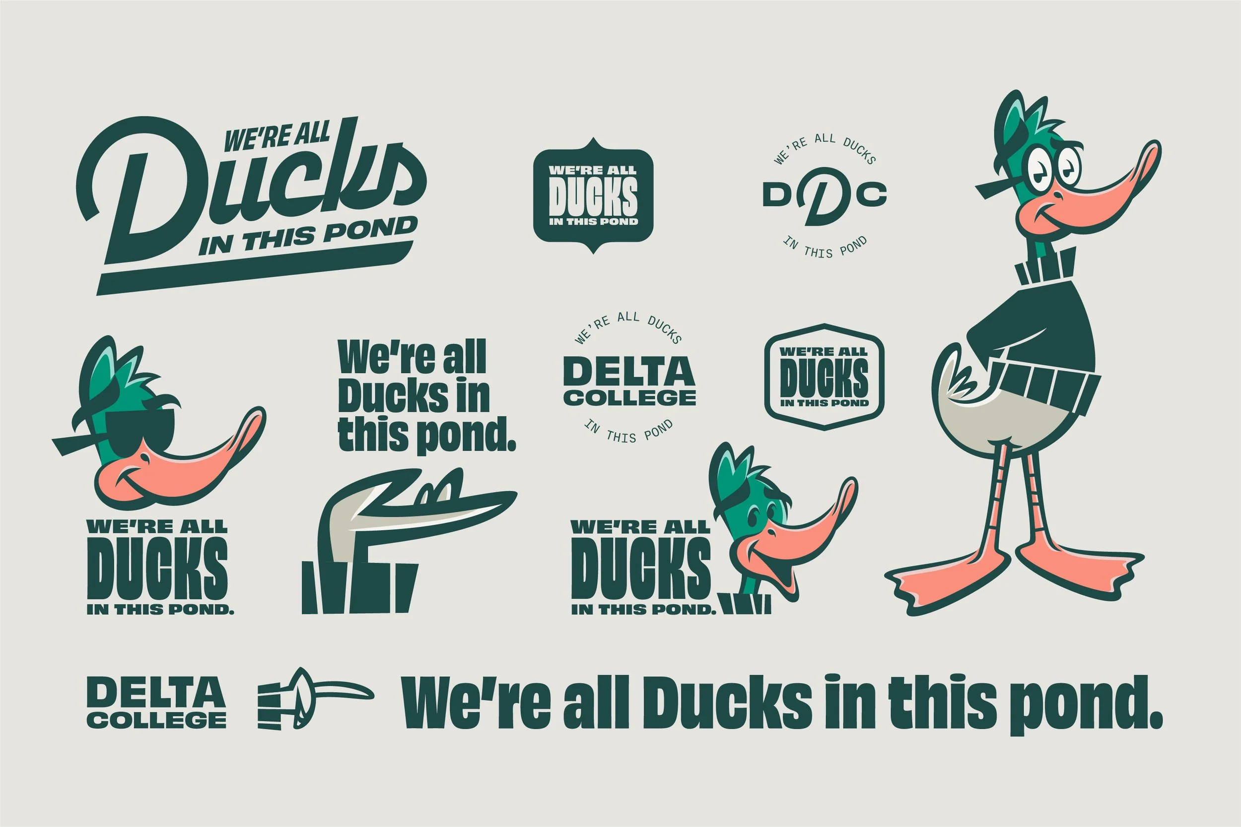
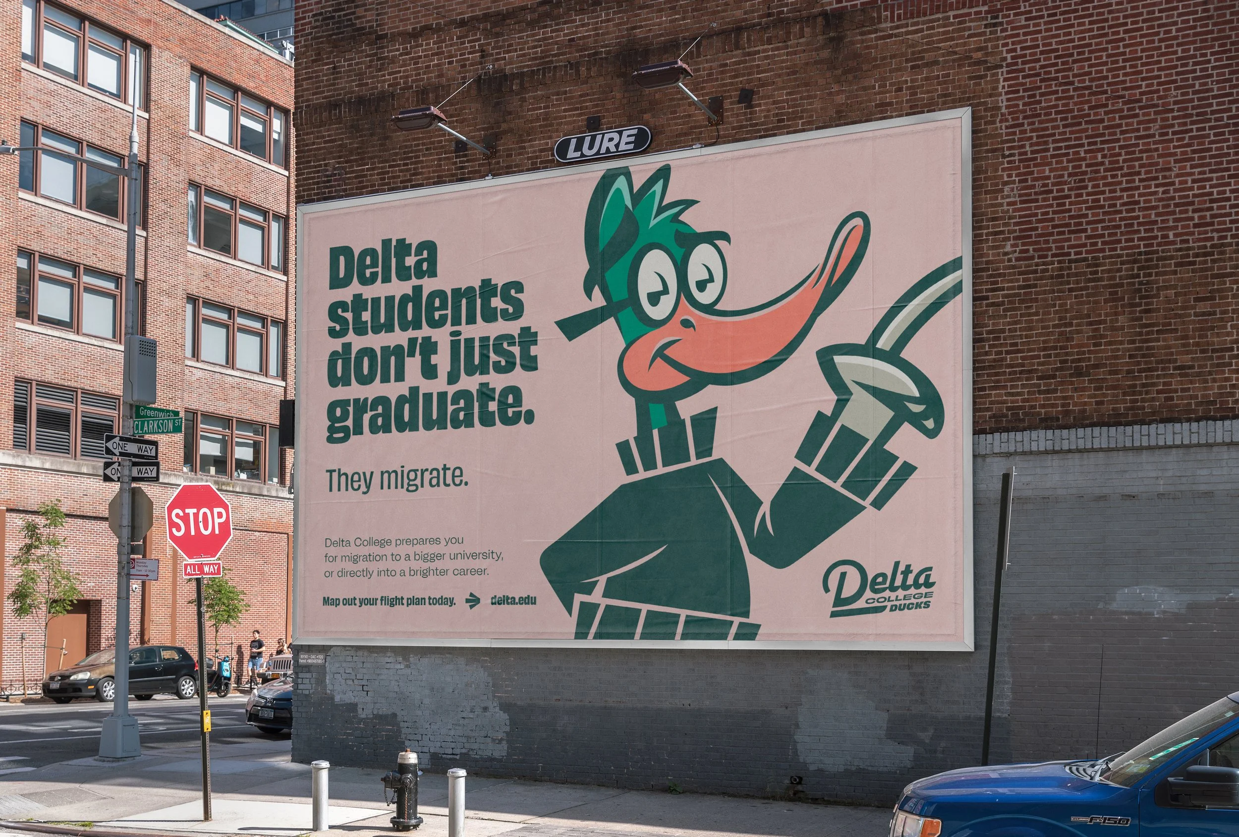
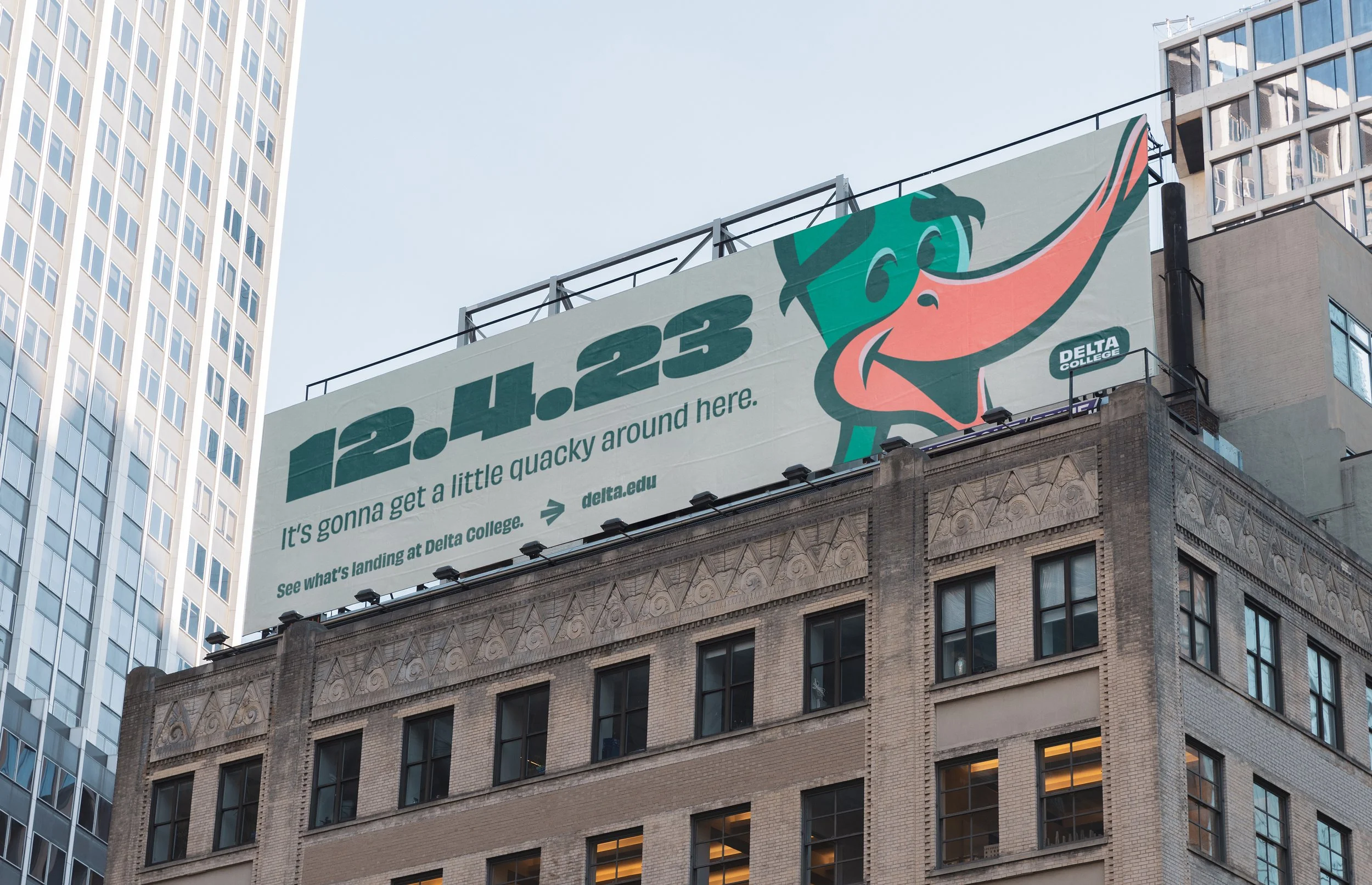
One pond, many Ducks.
Feathers flock together here.
At Delta College, the manmade pond is a symbol of community and belonging. Each year, ducks flock to this iconic spot, mingling with students and creating a lively, welcoming atmosphere. This connection inspired our tagline:
“We’re all Ducks in this pond.”
This tagline captures the essence of Delta College’s spirit. Just as the pond brings together ducks from all around, Delta brings together students from diverse backgrounds, fostering a sense of unity and pride. Once you enroll at Delta, you become part of this vibrant community. Whether you’re in the classroom, on the field, or just hanging out by the pond, you’re a Duck, and you belong here.
At Delta, we’re all Ducks in this pond, united by our shared journey and collective spirit.

photo credit: delta college
Brand Tone
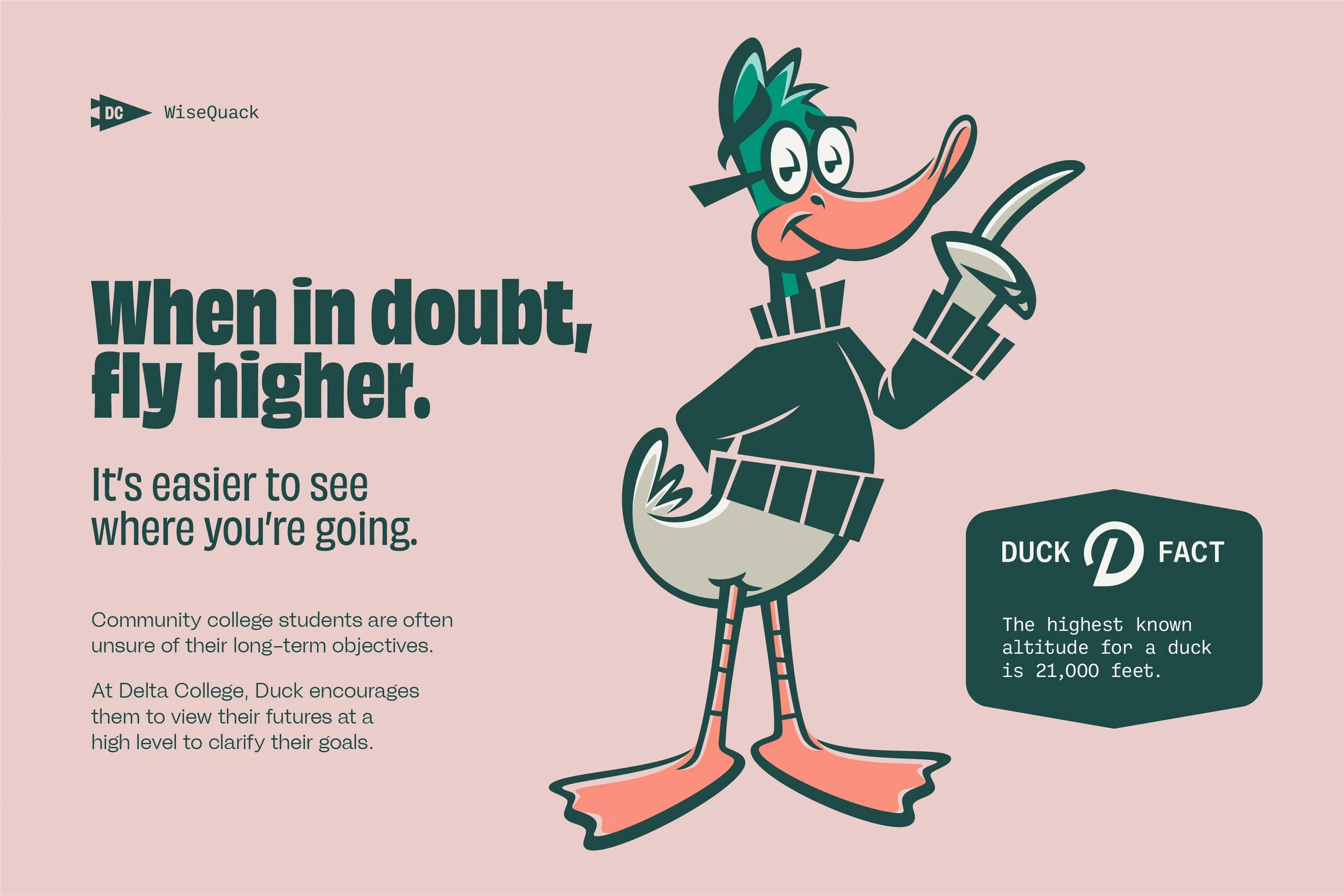
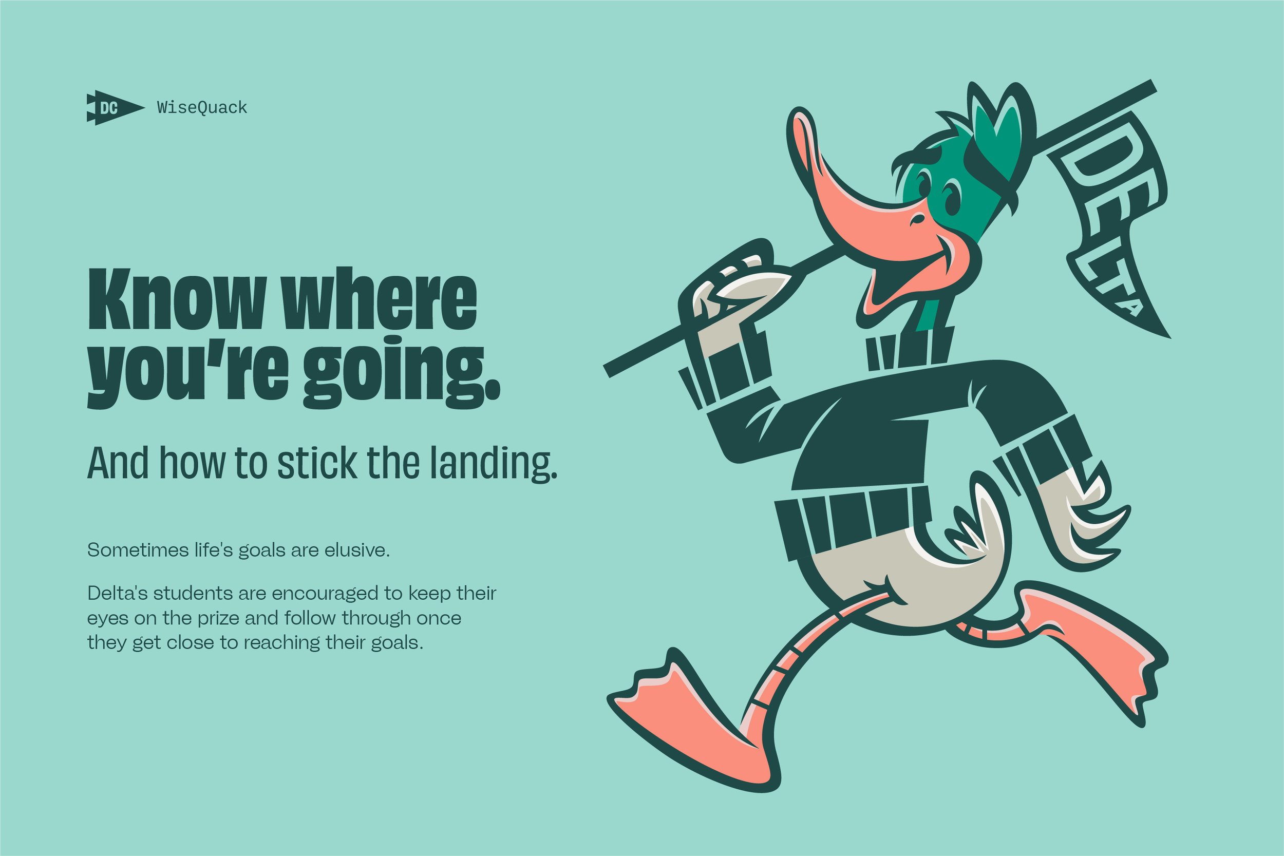
WiseQuacks.
Playful wisdom in every word.
The Delta College Ducks brand tone is engaging and playful, warm and smart, witty and wise.
With every uplifting quack, Duck brings a message of positivity and encouragement, creating an experience that feels energized and welcoming.
Duck reminds everyone that learning is not just important; it’s also fun.

applications


Rollout
photo credits: delta college


Jon and atomicvibe design lab quickly understood who we are and what we were trying to accomplish with this project. The mascot logo system, color palettes, fonts, graphic elements, brand and mascot character voice and personality, messaging, and asset applications fit us perfectly.
Jon is an immensely talented illustrator, communicator, and graphic strategist. We couldn't be happier with our experience with atomicvibe.
Leanne Govitz
Director of Marketing and Media Relations, Delta College